May 24, 2026
You may be sitting at a kitchen table with a small canvas, a jar of cloudy rinse water, and that familiar thought: I want to paint a sunset, but I don't want to ruin it in the first five minutes. That's a very normal place to begin. Sunset paintings look dramatic, yet the basic structure is kind to beginners once you understand what to do first, what to leave alone, and when to add the dark shapes that make the colours glow.
Acrylic is especially friendly for this sort of project. It lets you work in layers, correct awkward areas, and build a sky in simple bands instead of trying to force every colour to blend perfectly at once. If you've searched for Måla solnedgång akryl, you're in good company. In Sweden, the audience for arts and crafts is broad. The country's population was about 10.6 million in 2024, and around 1 in 4 Swedes participate in cultural activities linked to arts, crafts, or DIY-making in a typical year, according to the reference provided in this guide's source material, discussed in a Swedish tutorial reference.
A Scandinavian sunset has a quiet kind of drama. The light often sits low, the horizon feels long, and even strong colour still seems calm. That's why this subject works so well for a first painting. You don't need to draw a complicated scene. You need a soft sky, a clear horizon, and a few dark shapes placed with confidence.
Many beginners think the sun itself is the main event. Usually it isn't. Its beauty comes from the shift around it. Pale yellow near the horizon, a warm orange band above it, then rose, violet, and a cooler blue as the eye moves upward. When you paint those changes clearly, the sunset starts to feel believable even before you add trees, hills, or water.
A sunset gives you permission to simplify. You can:
That last point matters. You don't need a huge box of paints to make something beautiful. A limited palette often gives a more harmonious result.
A good first sunset doesn't need to be complicated. It needs a clear light area, a calm transition of colour, and one dark shape to anchor the scene.
There's also a lovely twist on this theme. These same sunset methods don't only belong on flat canvas. They work beautifully on carved wooden forms too. A curved object can turn a painted sky into something more personal, almost like a folk art keepsake you can hold in your hand. That idea becomes especially charming when the object already carries a Swedish craft feeling.
Before your brush touches paint, imagine the scene as three zones:
If you keep those zones clear, the painting stays organised. If everything becomes equally bright or equally detailed, the sunset loses its focus.
Buying supplies can feel harder than painting. The shelves are full of similar-looking tubes, and a beginner often comes home with either too much or the wrong things. Keep it simple. For a first acrylic sunset, you want a small, sensible kit that helps you blend broad areas and then add a few crisp details.
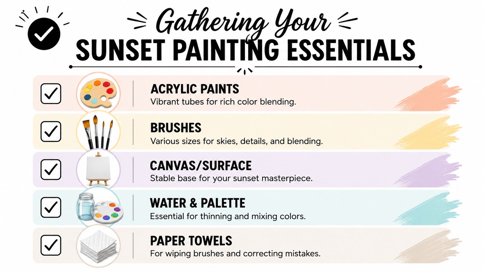
Start with these:
If colour mixing feels mysterious, a good visual reference helps. This colour mixing chart guide is useful when you want to understand how a few basic tubes become many sunset shades.
This palette is small, but it covers the whole mood of a sunset.
You can mix a lot from these few paints.
Try these simple combinations on your palette:
Practical rule: Mix more paint than you think you'll need for the sky. Running out halfway through a gradient is one of the fastest ways to make the colours look patchy.
A final tip. Put your colours on the palette in the same order you expect to use them, from light to dark. That tiny habit keeps your hand and your eye calmer while you paint.
Painters often tense up when approaching the sky. They think the blend must be flawless from the first stroke. It doesn't. Acrylic rewards steady, simple decisions more than nervous fussing. If you place the colours in the right order and move them gently into one another, the effect comes together.
For most sunsets, the lightest area sits low. That means your pale yellow, peach, or soft orange belongs near the horizon line. Above that, add warmer middle tones, then cooler purples or blues toward the top.
A simple painting order looks like this:
Work in horizontal strokes. Keep your hand light. Think of smoothing butter on warm bread, not scrubbing a floor.
The biggest beginner mistake is overworking. If you drag the same wet brush through every colour again and again, the sparkle disappears. Instead, blend only at the meeting points.
Use this rhythm:
That pause matters. Many paintings are spoiled not by too little blending, but by one extra minute of it.
Acrylic has a real advantage here. Swedish guidance on sunset painting highlights its forgiving layerability. You can build dark underlayers, then add warm reflections, clouds, or light on top without disturbing what's underneath. The same guidance also suggests varying tools, such as brushes, palette knives, and sponges, to change texture and how the light reads across the surface in a Swedish acrylic sunset guide.
A brush gives control, but it isn't your only option.
That flexibility is one reason acrylic feels less fragile than watercolour for this subject. If a cloud becomes too heavy, let it dry and paint over part of it.
For another painting medium comparison, this watercolour flowers article is a useful reminder that acrylic and watercolour behave very differently, especially when you want to correct and layer.
Once your first gradient is in place, let it settle for a moment. Then decide whether the sunset needs more contrast. Often it does.
You might add:
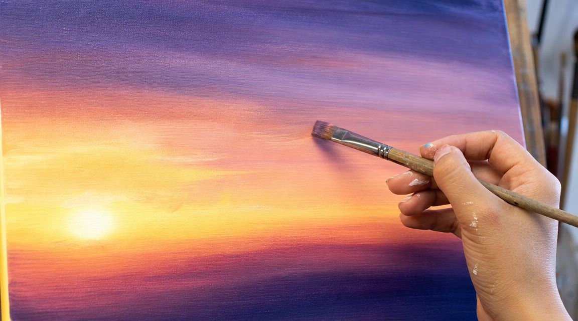
Here's a visual walkthrough if you like to watch the brush movement in action before trying it yourself.
Keep the darkest colours farther back and underneath. Add the glow later. That order gives the light more presence.
If your sky looks plain at first, don't panic. A sunset often looks unfinished until the dark foreground arrives.
A smooth sky is lovely, but the painting starts to feel complete when you give the eye something to rest on. That's where layers and silhouettes do their work. They create contrast, and contrast is what makes sunset colours sing.
Clouds are easier than they look if you think in soft masses instead of outlines. Load a brush with a small amount of paint, wipe off the excess, then drag or dab the shape lightly across the sky.
A few ways to keep clouds convincing:
If the cloud goes wrong, let it dry and repaint part of the sky colour over it. That's one of the joys of acrylic.
Beginners often think they need detail to make a painting interesting. With sunsets, you often need the opposite. A dark tree line, a ridge, or a cluster of pines can be enough.
Good silhouette ideas for a first piece:
Choose either black or a very dark purple. A dark purple can feel softer and richer, especially against orange skies.
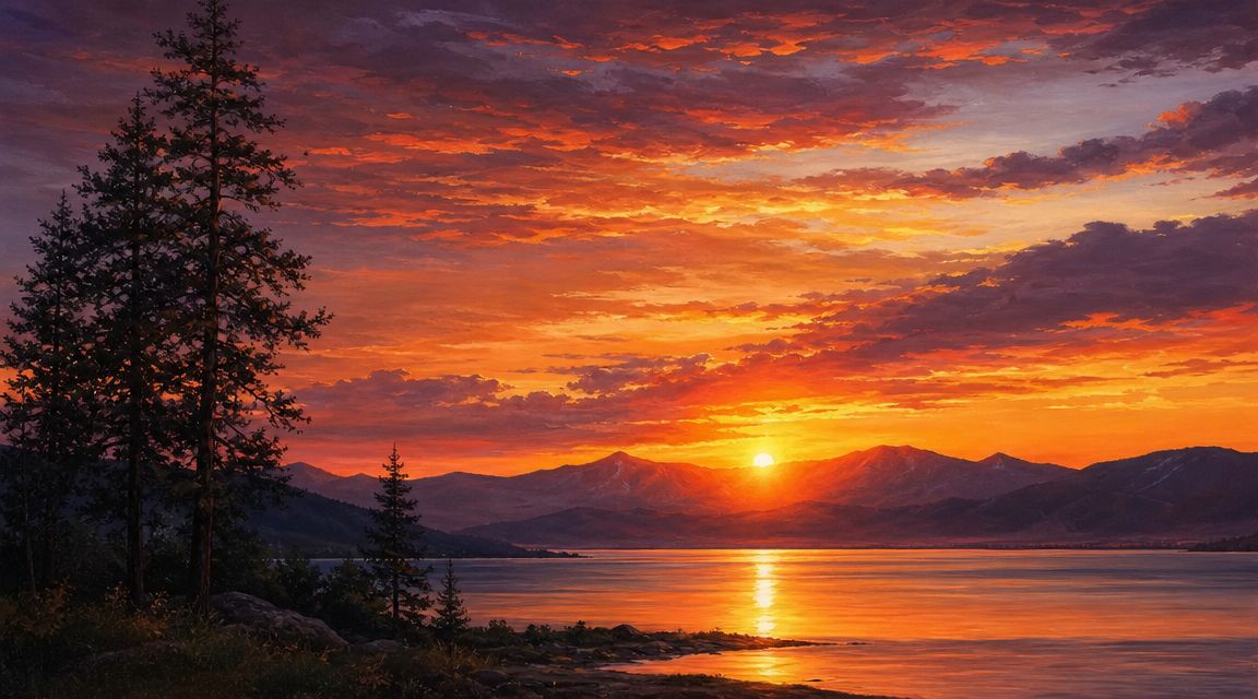
If your sunset includes water, you don't need to paint every ripple. Paint a horizontal reflection of the sky colours below the horizon, then add dark land shapes above and their broken mirror below.
A simple method works well:
Water reflections should usually be calmer than the sky above them. If you make the water busier than the sky, the eye gets confused.
Many beginners add birds, extra trees, more clouds, distant mountains, brighter highlights, and then wonder why the scene feels crowded. Pick one focal point. It might be the half-sun at the horizon. It might be a tall pine slightly off-centre. It might be the brightest reflection on still water.
When one part leads, the rest can support. That's when the painting feels intentional rather than busy.
The most reassuring thing about acrylic is that nearly every common mistake can be improved. Beginners often assume a bad patch means the painting is finished in the wrong way. Usually it just means one layer needs to dry before the next one goes on.
Muddy colour usually comes from one of three habits. You mix too many pigments together, you don't clean the brush enough, or you keep blending after the transition is already soft.
Try this instead:
Sometimes the colour bands look striped rather than blended. That can happen if the paint is too dry, the brush is too stiff, or you waited too long between bands.
You can soften the look by brushing a very small amount of the neighbouring colour over the line where they meet. Use a clean, slightly damp flat brush and keep the motion horizontal. If the edge has already dried fully, glaze a thin layer over it rather than scrubbing.
Generic tutorials often fail people, focusing only on brush control when your room also matters. In cooler Swedish homes, acrylic can behave differently. The verified guidance for this article notes that in cooler indoor conditions, paint has a slower open time, which affects blending and makes people wonder whether they should use mediums, retarders, or even a hair dryer to manage drying and avoid muddy transitions in a Swedish discussion of acrylic behaviour.
That sounds contradictory at first. Slower open time should help, shouldn't it? Sometimes yes, sometimes no. Longer wetness gives you more blending time, but it also means you can accidentally overwork the paint and dull the colour.
If your room is cool and the paint stays wet longer than you expect:
If your room is warmer and the paint skins over quickly, do the opposite. Work faster, mix your colours before starting, and paint the sky in a more organised sequence.
Don't fight the room. Notice how the paint behaves that day, then adjust your pace.
A flat canvas teaches the technique. A carved wooden figure turns it into an object with character. A Dala horse is especially satisfying because the body gives you broad side panels for the main sky, a curved back for the darker upper tones, and smaller areas where silhouettes can wrap around the form.

The biggest shift is this. You're not painting one rectangle. You're painting a shape that turns in the hand.
A few placement ideas help:
If you'd like a paintable base for this idea, an unpainted DIY Dala horse gives you the right kind of surface to personalise.
One charming layout is a lake sunset on the horse's side. Put the half-sun near the rear-middle of the body, place a dark pine line along the bottom, and pull a reflection downward. The rounded belly naturally supports water reflections because the horizontal brushstrokes curve gently with the form.
Another option is a forest sunset with no visible sun at all. Use the entire side for the gradient, then place tall pines in silhouette rising from the lower edge. This gives a more traditional Nordic mood and works well if you like a quieter finish.
A Dala horse doesn't need photographic realism. In fact, a simpler design often feels more in harmony with Swedish folk tradition. Strong colour, clear shapes, and a decorative sense of rhythm suit the object beautifully.
You can carry the same idea onto other wooden animals too. A rooster can hold a brighter, more playful sky. A pig can take a broad horizontal sunset with a low reflection. A bear or moose can support a deeper twilight palette with heavier silhouettes.
What matters is this: you've learned a method that can move from paper or canvas onto a carved object without losing its magic. That's when painting becomes more than practice. It becomes craft.
If you'd like to turn your first sunset study into a keepsake, Dalaart offers authentic Swedish Dala horses and DIY models that invite exactly this kind of personal painting project. It's a lovely way to pair acrylic technique with Scandinavian folk art and make something you'll want to display long after the paint has dried.


.svg)


.png)


