December 12, 2025
Think of a colour mixing chart as your personal paint recipe book. It’s a visual map that shows exactly what happens when you mix different paints, turning a few basic tubes of colour into a whole world of possibilities. For any painter, it's easily the most important tool for getting predictable, consistent hues every single time you pick up a brush.
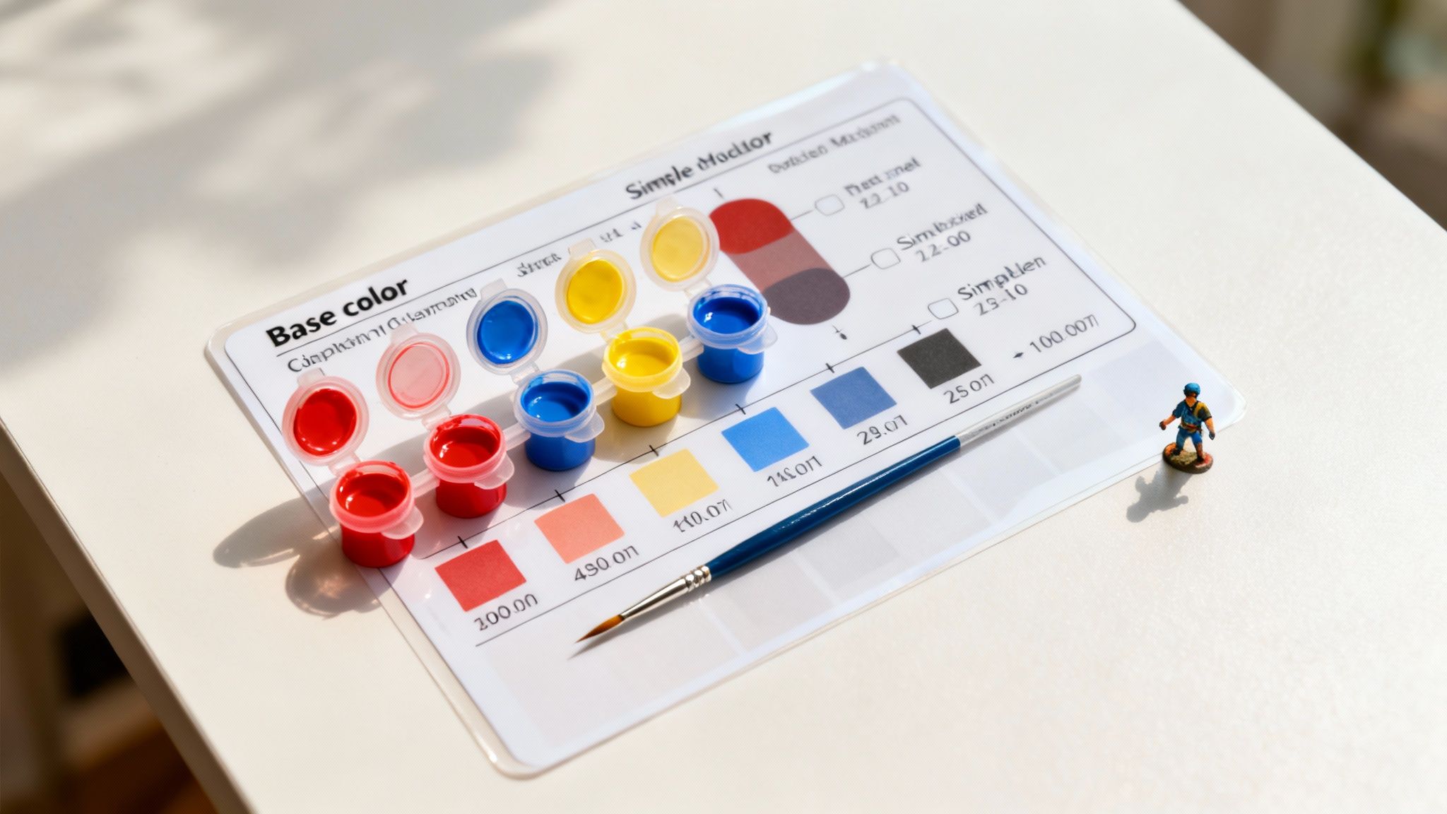
Welcome to the definitive colour reference for miniature painters. This guide is all about getting hands-on and practical, showing you how to create the precise colours you need. Whether you're bringing one of our uncarved Dala horse models to life or adding tiny details to your latest craft project, we've got you covered.
We'll walk through the foundational concepts—like primary, secondary, and tertiary relationships—and give you actual, usable recipes for common shades. Consider this your go-to resource for mastering colour, whether you’re aiming for a perfectly weathered, aged effect or a dazzling, magical glow.
We'll dive into everything from the basics of the colour wheel to more advanced techniques involving:
This guide is designed to give you the confidence to mix with absolute precision, every single time.
Before you even dip your brush, taking a moment to understand a little colour theory will save you a world of frustration. It’s the key to getting predictable, beautiful results every single time. Your best friend in this journey is the colour wheel; it’s a simple, visual map that shows you exactly how different hues play together.
Everything starts with the primary colours: red, yellow, and blue. Think of these as your building blocks—you can't mix other paints to create them, but you can use them to create everything else.
From there, you get your secondary colours (that’s your orange, green, and purple) by mixing any two of the primaries. It's straightforward: yellow and blue give you green, red and yellow make orange, and so on. Go one step further and you get tertiary colours, like red-orange or blue-green, by blending a primary colour with a neighbouring secondary colour.
Getting comfortable with these relationships is the first real step towards creating palettes for your models that feel balanced and look stunning. Once you master how colours complement or harmonise with one another, you'll have complete control over every shade you mix.
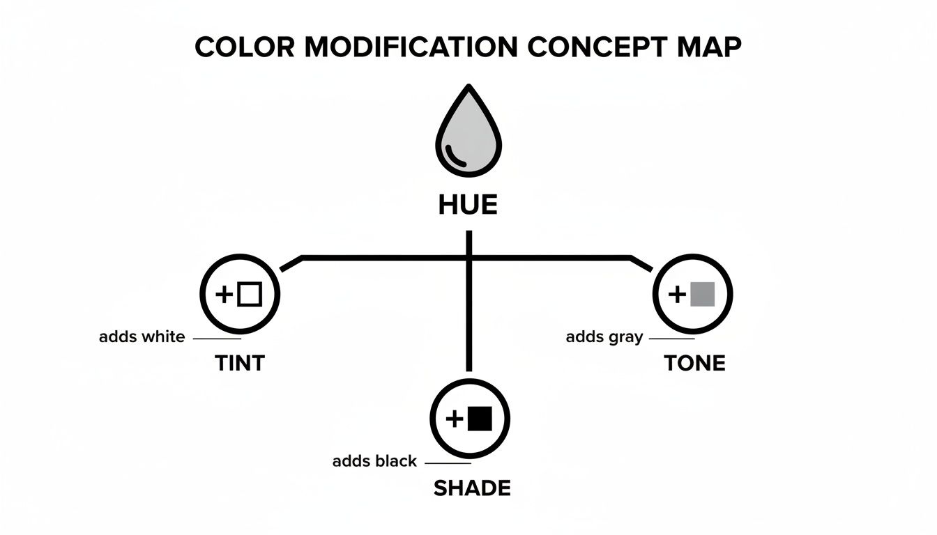
Once you've got your primary and secondary colours sorted, the real magic begins. This is where you move beyond the basic colour wheel to give your Dala models genuine depth and a touch of realism. We're talking about creating tints, shades, and tones. Each one plays a unique role in making your painted figures pop.
Simply put, a tint is any colour you’ve lightened by adding white. Think of it as adding light to your palette. Tints create those softer, pastel versions of your base colours, which are absolutely perfect for painting highlights, creating a faded look, or giving an object a sun-bleached feel. A classic example is adding a touch of white to a vibrant red to create a soft pink.
On the flip side, a shade is any colour you've darkened by mixing in black. This is your go-to technique for painting shadows and giving your models that crucial sense of three-dimensional form. Adding a bit of black to that same red we just used will give you a rich, deep burgundy, perfect for the shadowed side of a model's cloak.
Finally, we have tones, which you create by adding grey to a pure colour. Adding grey desaturates the hue, knocking back its intensity and making it appear much more naturalistic. This is an invaluable trick for painting realistic materials like weathered wood, old stone, or even dusty fabrics where a bright, pure colour would just look out of place.
The colour mixing charts we rely on today aren't a modern invention; they're built on centuries of artistic and cultural practice. It’s a tradition that spans the globe. In Southeast Asia, for instance, historical maps often used specific colour mixes to convey symbolic meaning, prioritising story over pure geographical accuracy.
This visual guide shows how you, as a modern artist, can do something similar by modifying a base hue to create different tints, shades, and tones.
This whole process is a mirror of how historical palettes were developed from the pigments available at the time. Pre-1800s maps from Thailand, for example, often featured rich yellow ochre mixes, with 80% of islands depicted in yellow to evoke the idea of ‘Golden Islands’. You can find similar inspiration when exploring the history of vintage posters from Sweden.
Tapping into this knowledge connects your own work to a deep, global tradition of using symbolic colour to tell a story.
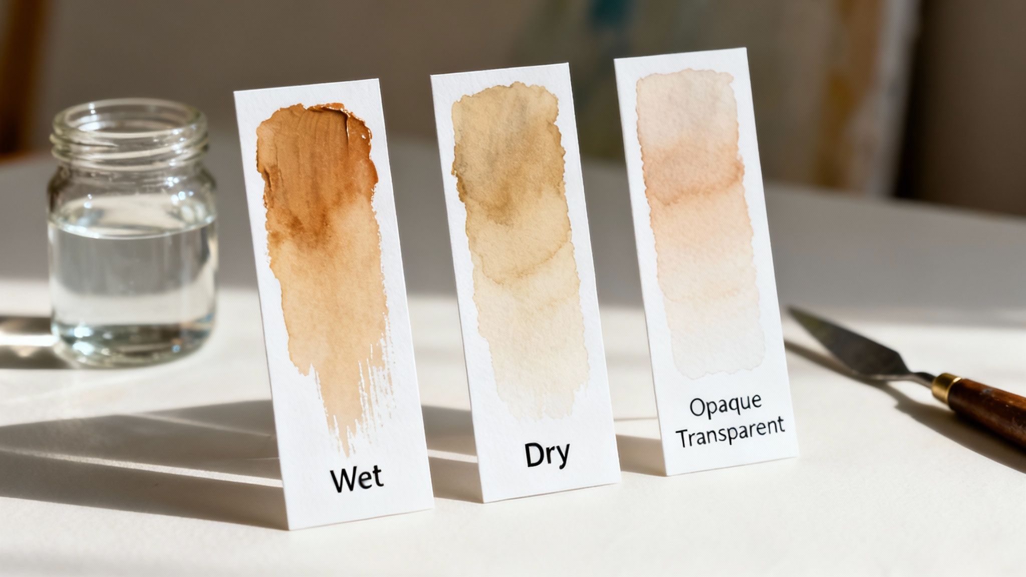
To really take your painting to the next level, you need to look beyond just the colour and understand the physical properties of your paint. Not all pigments are created equal, and they vary dramatically in transparency, which completely changes how they behave when you layer and mix them.
A transparent yellow, for instance, will give you a beautiful, luminous glaze that lets the colours underneath shine through. An opaque yellow, on the other hand, will create a solid, flat block of colour.
This isn't a new concept for artists, of course. This distinction has deep roots in history. Research into Javanese manuscripts from between 800-1400 CE shows that orpiment, a vibrant yellow pigment, was found in 62% of yellow mixes. If you're curious about historical palettes, you can dive deeper at the Mapping Colour in History project.
On top of pigment properties, you'll also need to account for the ‘drying shift,’ a classic trait of most acrylic paints where they appear darker once they're fully dry. To get around this, always paint small test swatches on a scrap piece of paper or card. This simple step takes the guesswork out of the equation, making sure the colour you mix on the palette is the exact colour you see in your finished piece.
Colour is so much more than what you see on a mixing chart; it’s woven deep into our cultures and emotions. While a chart is your practical guide to getting the perfect hue, it's also worth thinking about why certain colours feel right for a piece. What feels pure and clean in one part of the world might signify mourning in another—white is a perfect example of this.
This isn't just abstract theory; it has a real impact. A look at the Asia Color Survey shows just how different these gut feelings can be. In Thailand, a huge 65% of people felt that white and pastel mixes best represented 'health'. But in Vietnam, over 40% picked bold red-and-black combinations to show strong vitality.
Thinking about these deeper meanings can add a whole new layer of intention to your work. It's something we explore when choosing palettes for projects, like in our wood wall art guide, and it can make your finished piece resonate much more powerfully.
Every painter, sooner or later, hits a few snags. Think of this section as your painter’s first aid kit, packed with straightforward solutions for the most common colour mixing issues you'll run into while painting your Dala models and other craft projects.
One of the biggest frustrations is ending up with 'muddy' colours. This usually happens when you’ve accidentally mixed complementary colours together, or sometimes, just by throwing too many different pigments into the mix.
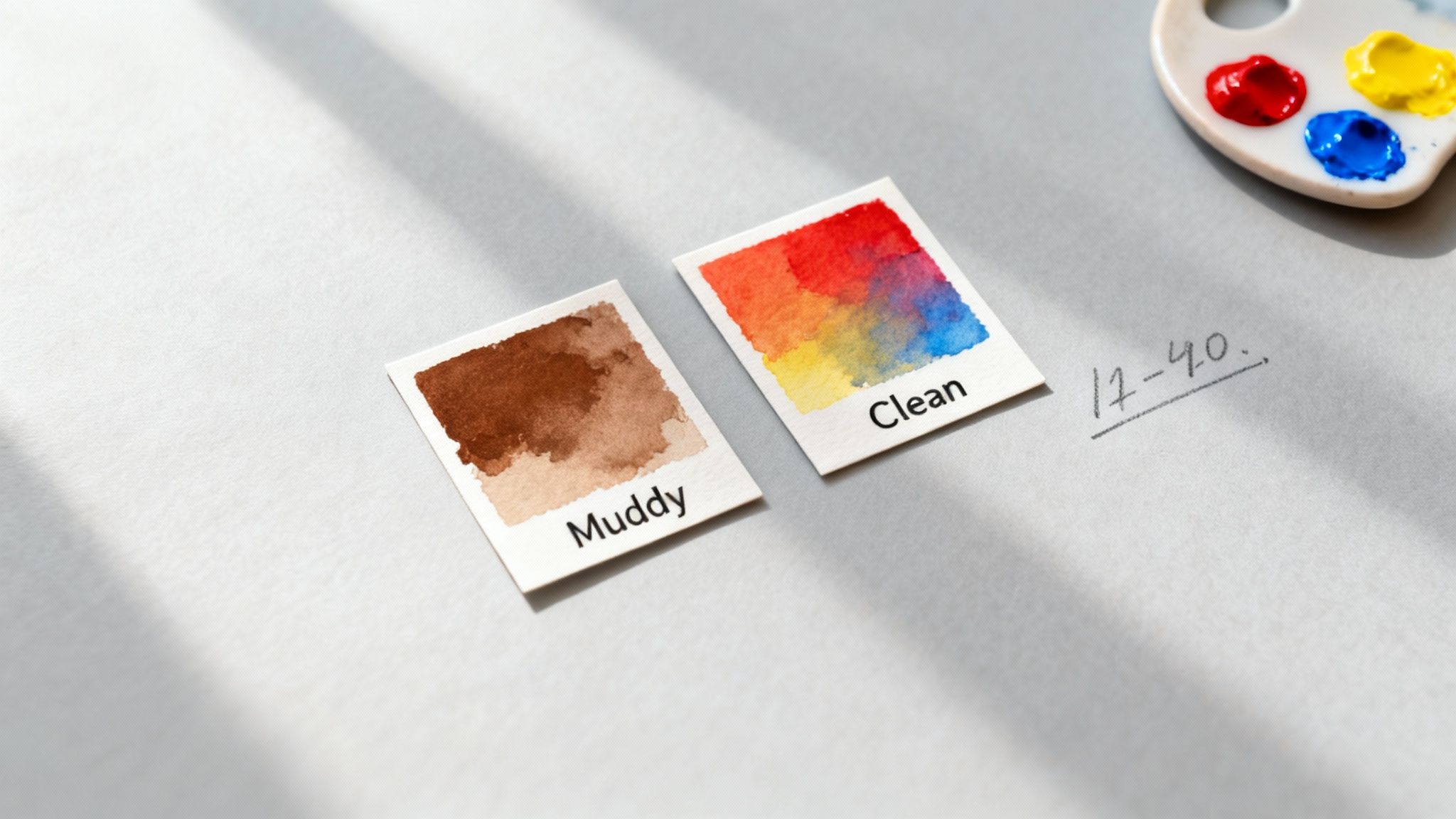
To keep your hues clean and vibrant, try sticking to a more limited palette. It also helps to be mindful of whether your paints have a warm or cool bias. Another classic problem is inconsistency – you mix the perfect shade, but can't for the life of you recreate it later on.
The easiest fix for this is simply to document your work. By creating and labelling swatches with the exact mixing ratios you used, you build a reliable, personal colour mixing chart. It becomes your go-to reference for any project down the line.
Every painter, from beginner to seasoned expert, runs into questions when trying to get their colours just right. Here are some of the most common queries we see, with practical answers to help you get back to painting with confidence.
Ah, the dreaded "mud." It usually happens when you mix too many different pigments together, especially complementary colours like red and green or blue and orange. To keep your mixes looking clean and vibrant, a good rule of thumb is to stick to blending just two or three colours at a time.
Another culprit is the hidden 'colour bias' in your paints. For instance, a 'cool' red (one that leans towards magenta) mixed with a 'cool' blue (like ultramarine) will create a much cleaner, brighter purple. If you mix a 'warm' red (leaning towards orange) with that same blue, you'll get a duller, more muted result. Sticking to a limited palette with distinct warm and cool primary colours can dramatically clean up your mixes.
This is a really common frustration for acrylic painters! It's called a 'colour shift' or 'value shift', and it's a natural part of how acrylics work. As the water in the paint evaporates, the clear binder that holds the pigment together becomes more transparent, which often makes the final colour appear darker and more saturated than when it was wet.
A simple workaround is to aim for a colour that’s slightly lighter than what you actually want. The best habit you can get into is to paint a small test swatch on a scrap piece of paper and let it dry completely. This way, you see the true final result before committing it to your model.
Consistency is everything, especially when you need to mix the exact same shade again for touch-ups or another part of your project. The most reliable method is to create your own physical colour mixing chart on a piece of sturdy paper or card.
Whenever you mix a colour you love, paint a small swatch of it. Right next to the swatch, jot down the exact paints you used and the approximate ratios (for example, '2 parts Ultramarine Blue + 1 part Cadmium Yellow'). This creates a permanent, visual record you can refer back to again and again.
Ready to create your own masterpiece? Explore the full range of authentic, unpainted Dala horse models at Dalaart and start your next creative project today. Find your perfect canvas at https://dalaart.com.


.svg)


.png)


