January 1, 2026
A Josef Frank poster is so much more than just a piece of art for your wall. It’s a little slice of design history, a joyful act of rebellion against the stark, rigid modernism of its time. Known for their vibrant, nature-inspired patterns, these prints bring an incredible warmth and sense of organic freedom into any home. They are, quite simply, the iconic work of one of Swedish Modern's most important figures.
To really appreciate these posters, you have to step into the lush, imaginative world of Josef Frank. He was an Austrian-born architect and designer who completely reshaped the character of Swedish design. His work is a true celebration of colour, life, and the untamed beauty of the natural world, standing in direct contrast to the severe, functionalist look that was dominating Europe back then.
Frank firmly believed our homes should feel comfortable, personal, and full of life—not cold or meticulously planned. You can see this philosophy woven into every single Josef Frank poster, where botanical shapes, whimsical creatures, and detailed landscapes seem to spill over with wonder and optimism. He was designing for people, not for abstract ideals.
Frank's journey brought him to Sweden in the 1930s, where he started a legendary collaboration with Estrid Ericson, the founder of the design powerhouse Svenskt Tenn. This partnership was the perfect platform for him to fully realise his creative vision. Together, they championed a softer, more eclectic, and human-focused approach that would come to be known as Swedish Modern.
"The home does not have to be planned out in detail, just put together by pieces its inhabitants love."
This simple quote really captures the heart of his approach. Frank’s designs were always meant to be mixed and matched, helping to create interiors that felt like they were collected and loved over many years.
The lasting appeal of a Josef Frank poster comes down to its incredible ability to inject pure joy into a room. His patterns are wonderfully complex yet perfectly harmonious, offering endless little details to discover. They seem to defy trends by focusing on timeless themes of nature and fantasy.
So, what makes his artistry so special?
Choosing a Josef Frank poster is really an invitation to embrace this philosophy. It's about filling your home with pieces that tell a story and reflect a vibrant, optimistic way of looking at the world. His legacy continues to inspire designers and art lovers who want to create spaces that aren't just stylish, but are also deeply personal and alive.
Every Josef Frank poster is more than just a beautiful design; it holds a story of courage, optimism, and artistic rebellion. To really get why these patterns are so full of life, you have to picture Europe in the 1930s, a time of rising political darkness. Frank, born in 1885, was already a well-respected Austrian architect, but as antisemitism swept through his homeland, he found himself at a crossroads.
In 1933, he and his Swedish wife, Anna, made the monumental choice to leave everything behind and flee to Stockholm. This wasn't just a move for safety; it turned out to be a pivotal moment for all of Swedish design. At nearly 50 years old, Josef Frank was about to start the most legendary chapter of his entire career.
He soon found a creative home at the prestigious firm Svenskt Tenn, founded by the forward-thinking Estrid Ericson. By 1934, their partnership was official, and Frank unleashed a torrent of creativity, designing the textiles and furniture that would completely reshape the Scandinavian aesthetic.
Back then, Swedish design was dominated by a very strict, functionalist style promoted by the state-backed Svenska Slojdforeningen (SSF). Think clean lines, muted colours, and no frills. Frank's work was the exact opposite. His vibrant, almost "gaudy" floral patterns were initially met with criticism for being far too extravagant for Swedish tastes.
But Estrid Ericson saw the magic in his vision. She gave him complete creative freedom, and together they began to mould 'Swedish Modern' into something warmer, more human, and bursting with personality. You could see the transformation in her own apartment, which went from blandly functional in 1930 to an explosion of joyful pattern by 1934.
Their collaboration hit the world stage at the 1937 Paris World Exhibition. The Svenskt Tenn pavilion, overflowing with Frank’s colourful textiles and innovative furniture, was an absolute sensation. It showed the world a modernism that wasn't cold and sterile but was instead full of joy and life. This was his international breakthrough, cementing his place as a design giant. The vibrant patterns found in many vintage posters from Sweden often echo this influential, exuberant style.
The chaos of World War II forced Frank to move yet again, this time seeking refuge in New York City from 1940 to 1945. You might think this period of uncertainty would stifle creativity, but for Frank, it was one of his most prolific. Working from his kitchen table in Manhattan, he sketched many of the prints that are now his most famous and beloved.
He painstakingly hand-painted the repeats for his patterns to give them an organic sense of "freeness" and movement, a quality that makes every Josef Frank poster feel so alive. This deep commitment to craftsmanship is why his designs never feel rigid or mechanical.
The immense collection of Frank's work is a cornerstone of Svenskt Tenn's legacy. Today, the firm's archives preserve over 250 of his signed prints and approximately 3,000 of his original drawings, ensuring his vision continues to inspire.
It's incredible to think that so many of his most iconic patterns were created during the darkest days of the war. It's a testament to his resilient optimism. He poured his longing for peace and nature into his art, creating fantastical gardens and dreamlike worlds that offered an escape. This history is key—it reveals the profound sense of hope woven into the very fabric of his designs.
After the war, Frank returned to Stockholm a celebrated hero. His work continued to fetch record prices at auction and solidify its place in the design pantheon. For collectors at Dalaart who cherish Swedish heritage, his posters share that same vibrant spirit found in Dala horse artistry—a perfect mix of folk tradition and modern flair. More than 80 years later, his designs are as fresh and influential as ever, proving that true artistry never goes out of style.
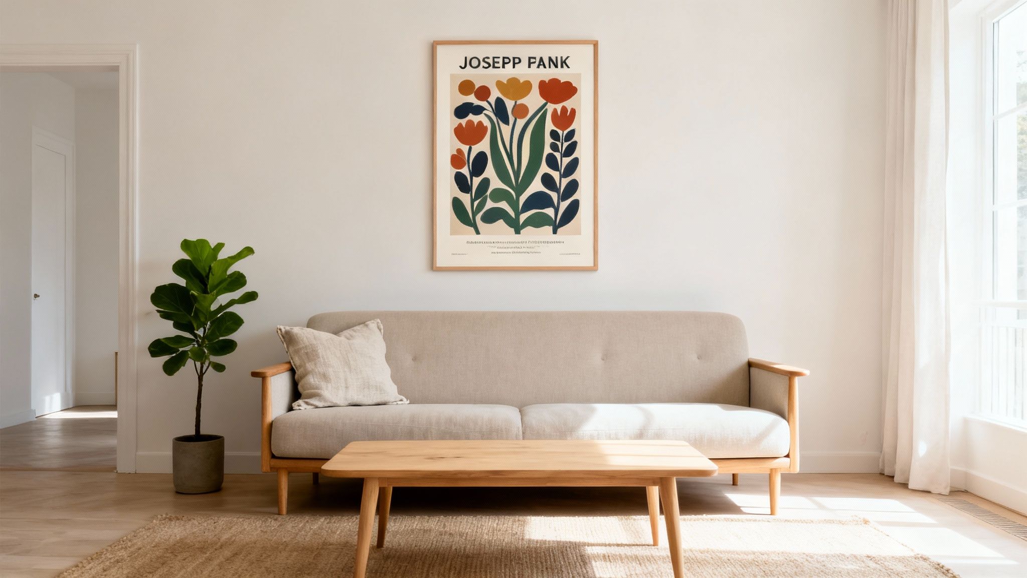
Bringing a Josef Frank poster into your home is a fantastic way to make your space feel truly yours. It’s a chance to pick a piece of art that really connects with you, but let's be honest—navigating the world of vintage treasures versus brand-new prints can feel a bit overwhelming at first. This guide will walk you through everything you need to know, helping you find that perfect poster that feels right for your home and your style.
The first big question is what kind of print you're after. Each type offers something different, from the thrill of owning a piece of history to the crisp perfection of a modern reproduction. Your final choice will come down to your budget, your goals as a collector, and simply what you love the look of.
As you begin your search, you'll find there are really three main categories of prints. Getting to know the difference is key to making a choice you'll be happy with for years to come.
For anyone serious about design integrity, choosing a licensed reproduction from a trusted source like Svenskt Tenn is usually the perfect balance of quality, authenticity, and accessibility.
This little guide can help you figure out which of Frank's iconic styles speaks to you the most, whether you're drawn to his vibrant florals or his more ordered geometrics.
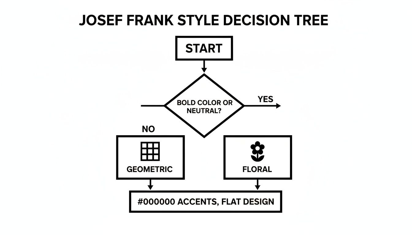
This decision tree breaks down Frank’s wonderfully diverse portfolio into some core aesthetic choices, steering you toward a pattern that will fit right in with your vision for your space.
While Josef Frank left behind a massive library of designs, a few have become true icons. Each pattern tells its own story and sets a completely different mood, which makes it easier to find one that feels like an extension of your own personality.
Think of it as choosing the right soundtrack for a room. Are you going for something energetic and worldly, or do you want a vibe that’s more whimsical and calm? Frank’s work covers the whole spectrum.
Here are a few of the most beloved designs to get you started:
A crucial element of Josef Frank’s design philosophy was avoiding rigid symmetry. His patterns, like "Aralia" and "La Plata," flow with an organic rhythm that gives them a lively sense of movement and energy, preventing them from ever feeling static or boring.
In the end, choosing your perfect Josef Frank poster is all about personal connection. Look at the colours, feel the energy of the pattern, and imagine the story it will tell on your wall. Whether you land on a rare vintage find or a crisp new reproduction, the right print will bring a timeless piece of design history and a burst of joyful creativity right into your home.
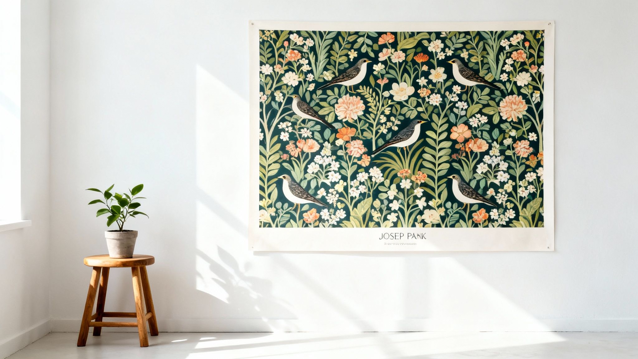
A Josef Frank poster is so much more than just a piece of wall decor. It’s a powerful statement piece, capable of completely transforming a room's atmosphere with its rich colour and life. Because his designs are so vibrant, they really demand a bit of thought about where and how to display them. Get it right, and a simple print becomes an electrifying focal point that anchors your entire design.
Whether you imagine it hanging proudly on its own or as the heart of a gallery wall, the trick is to give the poster's energy room to breathe. Its size, position, and the decor you surround it with all play a crucial role in unlocking its full magic, turning your wall into a canvas for Frank’s joyful, nature-inspired vision.
The first step in making your Josef Frank poster a true centrepiece is deciding exactly where it should live. It's easy to default to the wall above the sofa, but think about how the art can interact with the room's purpose and flow. Every spot in your home offers a unique stage to showcase its beauty.
Here are a few placement strategies that really work:
Frank’s designs, like the flowing botanical composition of "La Plata," have a lively visual rhythm all their own. This inherent movement makes them particularly effective in transitional spaces like entryways, where they can guide the eye and create a wonderfully welcoming sense of energy.
Ultimately, the goal is to position the poster where its colours and patterns can be fully appreciated without overwhelming the space. Take a moment to consider the sightlines from different parts of the room to make sure it makes an impact from every angle.
At first glance, the exuberant, colourful world of Josef Frank might seem like an odd match for the clean lines and neutral palettes we often associate with Scandinavian design. But this contrast is exactly what makes the pairing so incredible. His work provides the perfect, joyful counterbalance to Nordic minimalism, creating a space that feels both modern and genuinely warm.
The core principles of Scandinavian decor—natural materials, simplicity, and function—create the ideal backdrop for Frank's patterns. The clean, uncluttered environment allows the poster's intricate details and bold colours to truly shine without having to compete for attention. It's a classic case of opposites attracting to create something beautifully harmonious.
To make this pairing work, focus on creating a visual conversation between the art and the room. For instance, the organic forms in a "Vegetable Tree" print can echo the grain in a wooden coffee table or the leaves of a houseplant. You might even find inspiration for bringing in more natural textures by exploring ideas for wood wall art to complement the poster's theme.
Achieving a cohesive look is all about balance. The key is to let the Josef Frank poster inform the room's colour scheme and mood without completely dictating it. This approach keeps the space feeling personal and thoughtfully collected, rather than looking like a showroom.
Here are a few practical tips for styling your poster within a Scandinavian-inspired interior:
By following these simple guidelines, you can seamlessly bring a Josef Frank poster into your home. The result is a space that honours both the joyful exuberance of his art and the serene elegance of Scandinavian design, creating an interior that feels truly timeless.
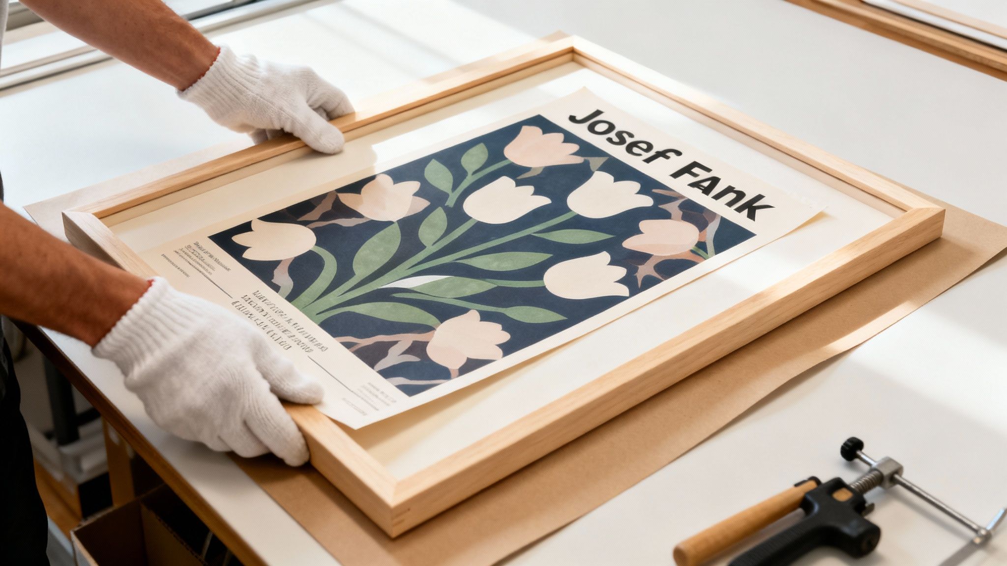
Getting your hands on a Josef Frank poster is an investment in timeless design, but the journey doesn't stop there. How you frame it is just as important. It’s not just about making it look good on the wall; it’s about protecting your art so it can be enjoyed for years, even generations, to come.
A great frame acts as a supportive partner to the artwork. It should enhance Frank’s vibrant, intricate patterns without stealing the show. Your choice of material, colour, and style is what turns a beautiful print into a true centrepiece for your home.
Choosing a frame is a delicate balance. You want something that reflects your personal style but also serves the artwork. The goal is to create a visual boundary that contains the poster's dynamic energy while tying it into your existing decor. Josef Frank’s designs are so full of life that often, a simple, high-quality frame is all you need.
Here are a few options that work beautifully with his posters:
The key is to steer clear of anything too ornate. Josef Frank’s art is the main event; the frame is just the stage. A clean, understated border will always let the poster’s joyful chaos shine through.
Once you’ve settled on a style, the next question is whether to frame it yourself or hand it over to a professional. While a DIY approach can be tempting and budget-friendly for standard reproductions, professional framing offers critical protective benefits, especially if you're working with a valuable vintage Josef Frank poster.
A professional framer brings expertise and access to archival-quality materials that are essential for long-term preservation. They know how to handle delicate paper and can ensure the final piece is not only beautiful but built to withstand the test of time. For a true investment piece, their skill can make all the difference.
Whether you go pro or DIY, using the right materials is non-negotiable for protecting your art. There are two elements that are absolutely critical for preventing fading and deterioration. Get these right, and the colours in your Josef Frank poster will stay as vibrant as the day it was printed.
Here’s what you need to insist on:
Taking these steps ensures your Josef Frank poster remains a stunning focal point in your home. With the right frame and a little care, you can confidently display his brilliant designs, knowing their beauty is well-protected for the future.
Getting your hands on a genuine Josef Frank poster is all about knowing where to look and what to look for. The hunt for the perfect piece can be just as exciting as hanging it on your wall, but it does require a bit of know-how. Whether you’re after a crisp new reproduction or a rare vintage original, understanding the marketplace is the key to buying with confidence.
For new, officially licensed prints, the one and only destination is Svenskt Tenn in Stockholm. They hold the exclusive rights to Frank’s enormous design archive, making them the true guardians of his artistic legacy. When you buy directly from them, you’re guaranteed impeccable colour accuracy, paper quality, and printing standards.
Honestly, it’s the most straightforward way to bring Frank’s art into your home with complete peace of mind.
For those of us drawn to the unique character and history of a vintage piece, the search becomes a bit more of an adventure. Hunting down an original Josef Frank poster takes patience and a good eye for reputable sources. These treasures are usually found through specialised channels where authenticity is everything.
Consider these trusted places to start your search:
Navigating the world of vintage art requires careful attention to detail, much like appreciating the nuances in other iconic art movements. For those interested in pop art, our guide on sourcing authentic Keith Haring posters offers similar tips on verifying authenticity and finding reputable dealers.
As with any famous artist, the market is unfortunately flooded with unauthorised copies and poor-quality prints. Knowing how to spot the red flags is crucial to avoid disappointment and ensure you're investing in a piece of art that will actually last.
Be wary of prints that just look… off. The most obvious signs of a fake often include blurry lines where there should be sharp details, or colours that seem washed out, faded, or just plain wrong compared to official versions. Another huge warning sign is the paper itself. A genuine Josef Frank poster is printed on high-quality, substantial paper. Fakes often use thin, flimsy stock that feels cheap to the touch. Always take a close look at the printing details and the feel of the paper before you buy.
Diving into the colourful, imaginative world of Josef Frank's art often sparks a few questions. Let's walk through some of the most common ones, so you can feel confident choosing and styling the perfect piece for your home.
It really depends on the piece. Original vintage posters from the mid-20th century, especially those in excellent condition, are highly sought after by collectors and can be quite valuable. Think of them as true pieces of art history.
On the other hand, licensed reproductions from Svenskt Tenn are much more accessible. While they don't carry the same collector's price tag, they're still a quality investment in timeless design that will bring joy for years to come. Ultimately, a poster's worth is tied to its rarity, its condition, and the enduring magic of Frank's work.
A few of his designs have become true icons of Scandinavian style. You've almost certainly seen 'Manhattan', his playful, map-like take on New York City, and 'Vegetable Tree', a wonderfully whimsical botanical print.
Other beloved patterns include 'Teheran', which feels like a dense and colourful floral carpet, and 'Brazil', a vibrant, life-filled tropical landscape. These prints are the perfect embodiment of his design philosophy: embracing bold colour and organic, flowing forms.
Frank was a champion of what he called 'Accidentism'—the idea that a home should look like it came together naturally and personally over time. It's a move away from rigid, perfectly planned spaces and toward a more relaxed, eclectic, and truly lived-in feeling.
Absolutely! In fact, mixing his patterns is the best way to embrace his concept of 'Accidentism'. Don't be afraid to play.
The trick is to find a common thread to tie the different designs together. This could be a shared colour that appears in both patterns or a similar scale in the designs. For instance, pairing a large-scale floral Josef Frank poster on the wall with cushions in a smaller, more geometric Frank pattern creates a beautifully layered and harmonious space that feels personal and curated, not chaotic.
At Dalaart, we share the deep appreciation for the Swedish artistry that Josef Frank so brilliantly championed. As you explore his iconic posters, we invite you to discover our collection of authentic, hand-carved Dala horses—pieces that echo the same heritage of vibrant colour and timeless design. Bring a piece of Sweden's rich creative history into your home by visiting us at https://dalaart.com.


.svg)


.png)


