April 26, 2026
You may be standing in front of a calm, well-loved room right now. Perhaps there’s a painted Dala horse on a shelf, pale timber under your hands, linen curtains softening the light, and a wall that feels almost finished but not quite alive.
That’s often the moment a mark rothko poster starts to make sense.
Not because it matches everything neatly, but because it changes the feeling of a space. A good Rothko reproduction doesn’t behave like filler décor. It acts more like a mood-setter. It can quiet a room, warm it, or give it a deeper centre of gravity. For people who already value craft, heritage, and emotional presence in objects, Rothko’s work can feel surprisingly familiar.
A Rothko poster can look simple at first glance. Large bands of colour. Soft edges. No figures, no scenery, no obvious story. That simplicity can be misleading.
What you’re really choosing isn’t just an image. You’re choosing atmosphere.
In a Scandinavian-inspired home, that matters. Folk pieces such as carved wooden animals, painted antiques, woven textiles, and handmade ceramics already carry feeling through colour, surface, and tradition. Rothko works in a different visual language, yet he asks for a similar kind of attention. He invites you to slow down and stay with colour long enough for it to affect you.
That’s why it helps to think like a curator rather than a casual shopper. Before you pick a print, ask a few grounding questions:
Practical rule: If you’d normally choose wall art by matching colours alone, pause and choose by mood first.
A Rothko poster often works best when it isn’t treated like a gap-filler. It deserves the same thought you’d give to a handmade object with history behind it. If you’d like a broader framework for placing art at home, this guide to choosing paintings for your wall is a useful starting point.
The best choice usually isn’t the loudest one. It’s the one that changes the room subtly every time you enter.
Mark Rothko wasn’t painting decoration. He was building encounters.
He was born Markus Yakovlevich Rothkowitz on 25 September 1903 in Dvinsk, in the Russian Empire, now Latvia. He immigrated to the United States with his family in 1913 at age 10, later changed his name to Mark Rothko in 1940, and became renowned for colour field paintings from 1949 to 1970 with irregular rectangular colour regions associated with abstract expressionism, as noted in this biographical overview of Mark Rothko.
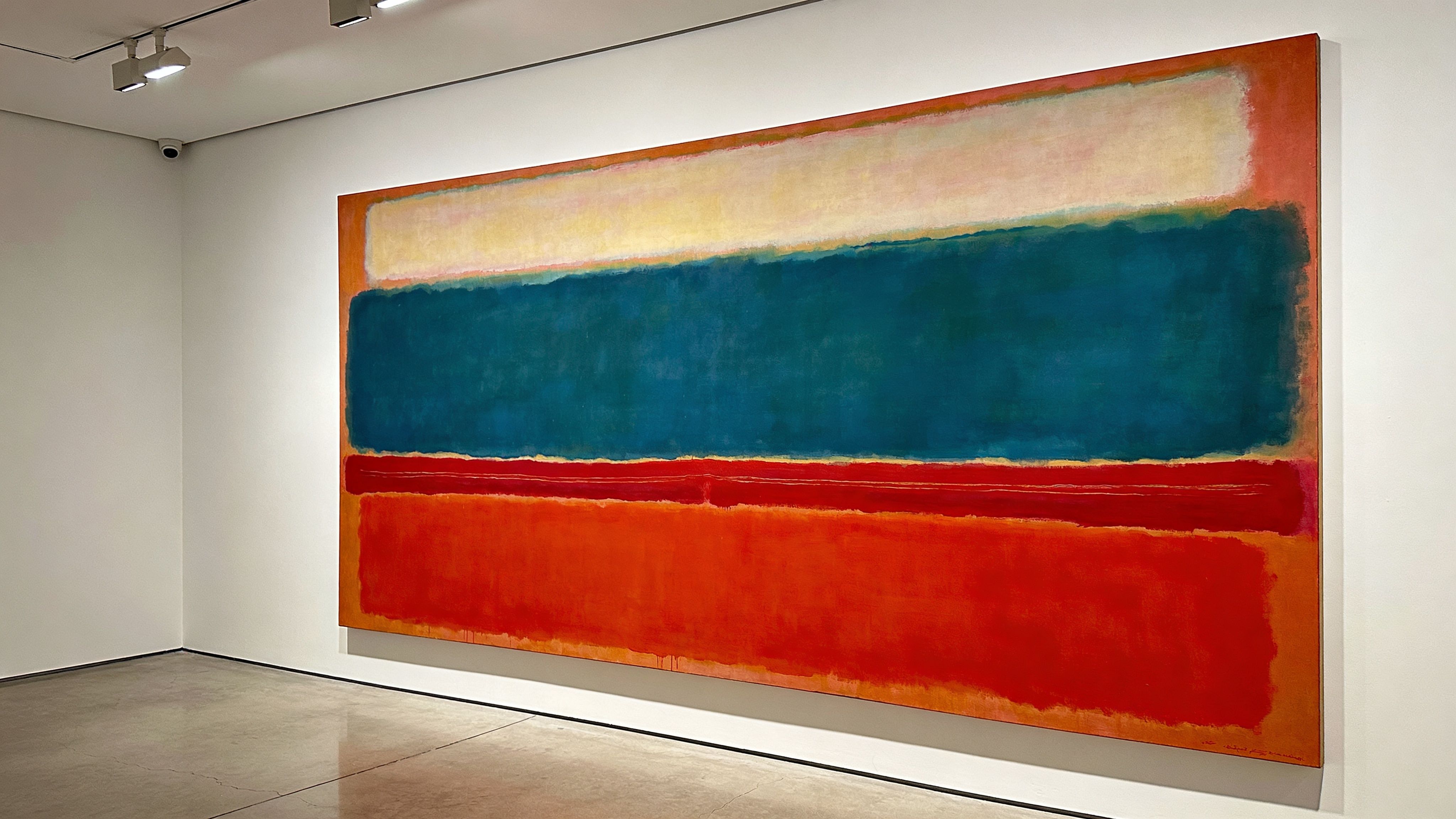
Rothko’s mature works are often described through art history terms like Colour Field painting, but the idea is easier to grasp in ordinary language. Think of standing before a northern sky at dusk, or looking into the embers of a fire. You’re not reading a scene. You’re absorbing a field of shifting sensation.
His paintings tend to use broad floating forms, but they don’t feel hard-edged or mechanical. The colours blur, breathe, and hover. That haziness is part of their emotional power. The surface seems still, yet the painting feels alive.
For a poster buyer, that matters. A weak reproduction will show only blocks. A better one will preserve the soft transitions that make Rothko feel human rather than graphic.
Rothko cared profoundly about how a viewer physically met the work. He famously recommended standing as close as 18 inches from his large-scale paintings so the colour could feel immersive and intimate. He wanted an encounter with colour and emotion, not a polite glance from across the room.
Stand closer than you think. Rothko often becomes more moving when the edges soften and the colours begin to surround your vision.
That idea can help you at home. Even if you’re buying a poster rather than an original, placement still changes the experience. A Rothko print hung too high, too far away, or in a visually crowded corner can lose what makes it special. Hung at a comfortable viewing height, with room around it, it starts to function less like ornament and more like presence.
People often assume abstract art must be solved intellectually. Rothko is a good artist for unlearning that habit.
You don’t need to decode symbols or identify hidden subjects. Instead, ask simple questions. Does this version feel warm or remote? Restful or uneasy? Does it deepen the room’s emotional tone, or flatten it?
That shift in approach is helpful for anyone coming from folk art. A carved horse and a Rothko canvas may look unrelated, but both can hold memory, ritual, and mood. One tells through form and tradition. The other tells through colour and scale.
The phrase mark rothko poster covers several very different things. Some are simple decorative prints. Others are closer to collectible art objects. If you don’t sort those categories early, it’s easy to overpay for something ordinary or overlook something well made.
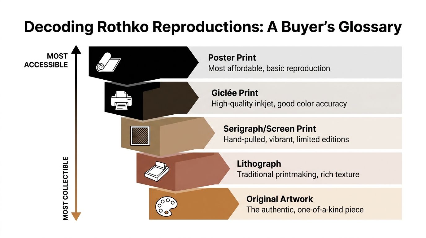
This is the most accessible option. A standard poster is usually made for easy framing and broad decorative use.
It can be a good choice if you want to test how Rothko feels in a room before committing to a finer print. It’s also practical for student spaces, temporary styling, or larger walls where budget matters.
The trade-off is usually in nuance. Rothko depends on subtle colour shifts, and basic poster printing can make those transitions look flatter than they should.
A giclée is a high-quality inkjet reproduction, usually printed with more attention to colour accuracy and paper quality than a basic poster. For many homes, this is the sweet spot.
If you want a print that still feels refined up close, this is often the category to look for first. The best ones handle soft edges and layered tones more gracefully, which is essential for Rothko.
A giclée won’t automatically be excellent, though. Sellers use the term loosely. You still need to ask about paper, finish, and image detail.
Some buyers encounter serigraphs or screen prints when browsing art print marketplaces. These use a more manual process and can have a distinct surface character.
They’re not the same thing as a standard poster, and they often appeal to people who want something with a stronger sense of printmaking craft. For Rothko, this category can be interesting, but it isn’t always the easiest route for a beginner because availability and consistency vary widely.
A lithograph belongs to a more traditional printmaking lineage. For many collectors, it feels like a step closer to owning a true art object rather than a decorative reproduction.
That doesn’t automatically make it “better” for every room. It means the print may have more collectible appeal, more process behind it, and often more need for careful buying. If provenance, edition details, or print history are unclear, pause before purchasing.
Collector’s note: “Limited edition” sounds impressive, but edition size alone doesn’t guarantee quality, value, or fidelity to Rothko’s original surfaces.
This is the category many careful buyers prefer when they want confidence in legitimacy and reproduction standards. An authorised print is produced with formal licensing or estate approval.
That matters because Rothko’s work is unusually sensitive to bad colour handling. Officially licensed versions often give you a better chance of receiving a print that respects the original composition and tonal relationships.
If you’re also interested in older decorative print culture, this guide to vintage posters in Sweden gives useful context for how reproduction formats can differ in purpose and character.
If you want a low-risk decorative entry point, start with a poster print. If you care about surface and colour, look closely at giclées. If you enjoy the collecting side of art, lithographs and authorised prints deserve more attention.
The right choice depends less on status and more on your purpose. A modest but well-chosen print can feel far more convincing than a supposedly premium one chosen without understanding.
A poor Rothko reproduction usually fails in a very specific way. It turns living colour into dead colour.
That sounds dramatic, but anyone who has seen a muddy digital print beside a better-made one knows the difference instantly. Rothko needs softness, depth, and a sense that one layer of colour is breathing through another. If the print looks like clean rectangles dropped onto a background, something has gone wrong.
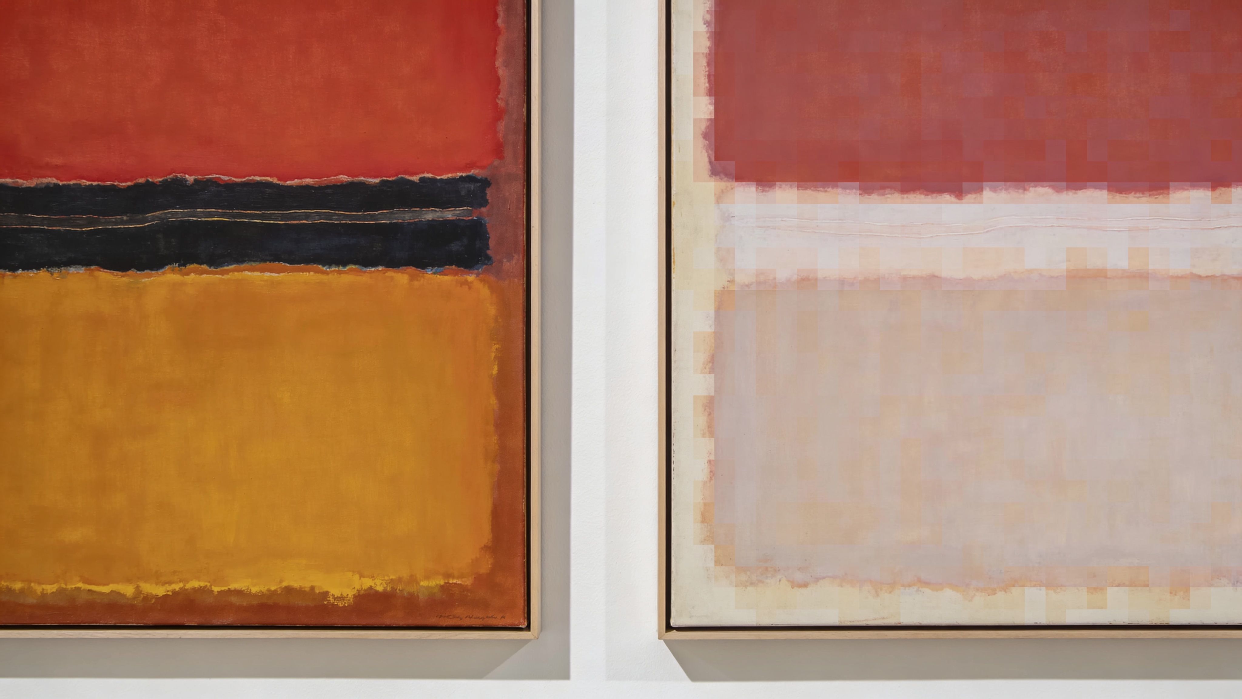
Many buyers focus on whether the print includes the “right” red, plum, ochre, or black. That’s only part of the job.
What matters just as much is how one colour moves into another. In a good Rothko reproduction, the edges shouldn’t feel clipped or mechanically sharp. They should look slightly suspended, as if they’ve settled into the paper rather than been stamped onto it.
When evaluating an online listing, zoom in. If the image still looks smooth and atmospheric at close range, that’s a good sign. If it becomes harsh, pixelated, or strangely glossy, be cautious.
Paper isn’t an afterthought. It shapes how light sits on the image.
Thin glossy stock often makes Rothko look louder and cheaper than intended. A heavier matte or softly textured paper usually supports the work better because it keeps reflections down and allows the colour to feel more settled.
You don’t need to become a paper expert. A few practical checks are enough:
A useful comparison is fabric. Hand-dyed cloth has depth and slight variation. A cheap synthetic print can show the same colour, yet still feel flat.
Large abstract works tempt buyers to size up. That can look wonderful, but only if the source image is strong enough.
A small digital file enlarged too far may blur the edge detail or reveal pixel structure. On a Rothko, that damage can be easy to miss in thumbnail form and disappointing once framed. Request a close-up preview if the seller doesn’t provide one.
Rothko usually benefits from restraint. A slim wood frame, a simple black frame, or even a clean unadorned mount can let the colour lead.
Avoid frames that turn the piece into a costume drama. Heavy ornament, overly glossy glazing, or busy mounts can distract from the quiet pull of the image.
A few signs you’re looking at a thoughtful print:
A strong reproduction won’t imitate the original perfectly. It will do something more realistic and more useful. It will preserve enough of Rothko’s atmosphere that the room begins to change around it.
Rothko can seem like an unlikely companion for Scandinavian folk art until you place them in the same room. Then the relationship becomes clear. Both depend on colour with purpose. Both reward quiet attention. Both can carry more feeling than their forms first suggest.
Recent search data points to growing curiosity in this overlap. Over the last 12 months, searches for “mark rothko poster” rose by 28% in Poland and 35% in Romania, according to this market-interest reference for Mark Rothko poster searches. That rise fits a broader appetite for interiors that blend modernist calm with folk character.
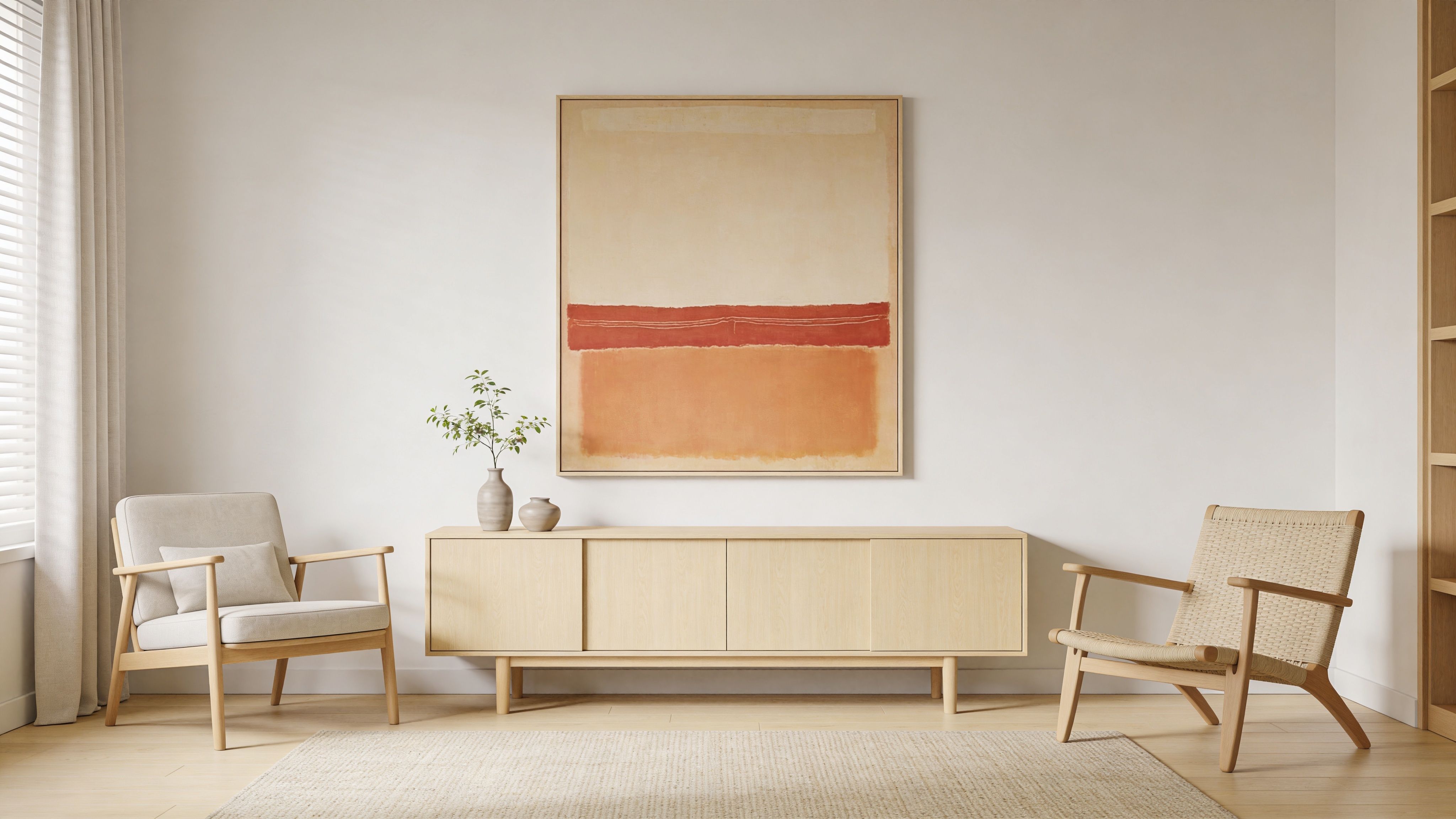
A warm-toned Rothko, especially one built from reds, rusts, burgundies, or orange-browns, can speak beautifully with traditional painted objects. If you own a classic red Dala horse, place the poster nearby but not directly above it in a cramped way.
Give each piece breathing room. The conversation works best when the folk object keeps its handmade detail and the poster provides the wider emotional field around it.
This pairing also suits timber furniture with age in the grain. Pine chests, oak sideboards, spindle-back chairs, and woven runners all soften the modernism and keep the room from feeling too stark.
Some homes lean toward chalky whites, greyed blues, stone, flax, and soft ash wood. In that setting, a cooler Rothko can become the room’s meditative anchor.
Look for prints with layered blue, plum, charcoal, or muted violet relationships. These can deepen a simple room without disturbing its calm. They’re especially good in bedrooms, reading corners, or dining spaces where you want stillness rather than display.
If you enjoy modern Scandinavian print culture more broadly, a Josef Frank poster offers an interesting contrast in pattern, rhythm, and decorative energy.
A common mistake is assuming “bold art” requires “minimal everything else”. In a folk-inspired interior, the better question is whether objects compete for the same job.
A carved animal, for instance, invites close looking through shape and painted detail. A Rothko poster works through atmosphere and field. They can coexist because they operate differently.
Use these simple pairings:
Here’s a short visual reference that helps many first-time buyers think about mood and placement:
Not every wall needs this kind of intensity. Rothko usually shines where people pause.
The most successful pairing often comes from contrast with respect. Let the handmade object show its tradition. Let the Rothko hold the room’s emotional weather.
Buying a Rothko reproduction responsibly means asking better questions than “Do I like this image?” You also need to know who made it, how it was printed, and whether the seller is telling you clearly what it is.
Museum shops are often the most reassuring place to start. They usually offer clearer licensing and better baseline quality control. Established print sellers can also be good, especially when they provide detailed paper, size, and framing information. Marketplaces and vintage platforms can be rewarding, but they require slower reading and sharper judgement.
Send the seller a message if the listing leaves gaps. A serious seller should be able to answer straightforwardly.
For buyers who care about environmental impact, older posters can be appealing for more than style. Vintage Rothko posters offer a lower carbon footprint than new prints, and a newer sustainability trend includes estate-approved digital remasters released in October 2025 through Museums.Co, printed on 90% recycled paper with environmentally safe inks, according to this Chairish overview of Mark Rothko posters.
That won’t make every vintage poster the right choice. Some older prints are beautifully aged. Others are tired, faded, or poorly stored. Ask for clear condition photos before committing.
A good print deserves decent framing. Use UV-protective glazing if the work will hang in bright daylight. Keep it out of direct sun when possible, especially if the piece has delicate darks or soft transitions.
Frame choice should support the work, not overpower it. Rothko usually benefits from simplicity and space around the image. If in doubt, choose the quieter option.
The most responsible buyer isn’t the one who spends the most. It’s the one who understands what is being bought, how it was made, and how it will live in the home for years rather than months.
A Rothko poster is a personal purchase, even when it’s carefully researched. You can compare print types, study paper finishes, ask the right questions, and still come down to one simple test. Do you want to live with this colour?
That question matters more than trend or status. Some people want a decorative accent. Others want a piece that slows the room and deepens it. Neither motive is wrong. What matters is choosing a reproduction that fits your intention and respects the original work enough to carry some of its feeling.
For lovers of Scandinavian folk art, that choice can be especially rewarding. A handmade painted object and a thoughtfully chosen Rothko print may come from different traditions, but both can bring soul into a room. Both ask you to notice colour. Both make a home feel curated rather than merely furnished.
If your eye keeps returning to one Rothko, pay attention to that. It’s often the clearest answer you’ll get.
If you love the meeting point between Scandinavian tradition and modern visual calm, explore Dalaart for authentic Swedish Dala horses and companion pieces that bring craftsmanship, colour, and heritage into the home with the same thoughtful presence you’d want from your art.


.svg)


.png)


