January 23, 2026
A vintage ski poster is so much more than just a piece of decoration. It's a tangible piece of history, a snapshot from the golden age of alpine adventure. These artworks, which started life as simple advertisements, have blossomed into cherished collectibles that perfectly blend nostalgia, dynamic art, and the undeniable thrill of the mountains.
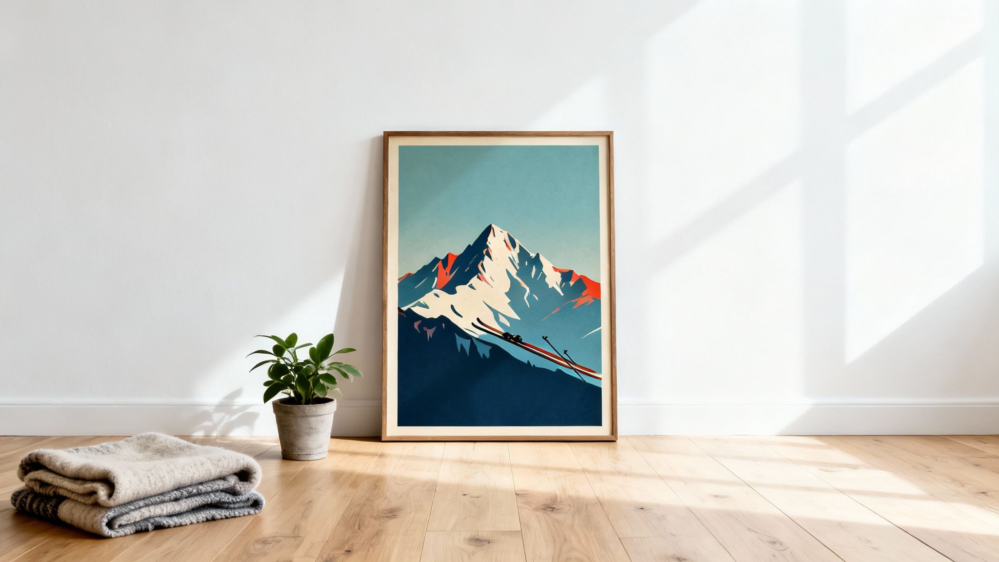
Picture a cosy mountain cabin. The air smells of pine, and a fire crackles warmly in the hearth. On the walls hang vibrant posters that instantly transport you to a time when skiing was less a sport and more a lifestyle of glamour and bold exploration. This is the magnetic pull of the vintage ski poster.
These pieces do more than just show snowy landscapes; they capture a feeling. They tell stories of thrilling descents, of legendary resorts, and of an era when the world was first discovering the exhilarating freedom of the slopes. For many, they spark a deep nostalgia for adventures past, while for others, they inspire dreams of those yet to come.
The sheer artistic merit of a vintage ski poster is at the heart of its lasting appeal. Often featuring bold colours and striking, simplified compositions, these works are incredible examples of major 20th-century art movements. Just think of the rich reds popping against icy blues in an Art Deco design, or the playful illustrations that perfectly capture the dynamic movement of a skier on a snow-covered peak.
It's this potent mix of historical significance and aesthetic beauty that has fuelled a major comeback in recent years. Both seasoned collectors and interior designers are on the hunt for pieces that inject character and a unique story into a space.
A great vintage ski poster is a conversation starter. It invites guests to share their own stories of the mountains, connecting people across generations through a shared love for winter and adventure.
The clean lines and functional beauty found in so many mid-century ski posters align perfectly with the core principles of Scandinavian design. This natural connection makes them a fantastic fit for modern interiors that value simplicity, nature, and craftsmanship. Because they act as both art and historical artefact, they add a wonderful depth to otherwise minimalist spaces.
Whether you're decorating a rustic lodge or a chic city flat, a vintage ski poster provides a window into the past and an inspiration for the future. They're a beautiful reminder that skiing is about so much more than just speed—it’s about community, beauty, and the shared experiences we find in breathtaking scenery. This guide will walk you through their rich history, help you spot authentic pieces, and show you how to weave their timeless charm into your own home.
The story of the vintage ski poster is a fantastic ride, one that perfectly mirrors the rise of skiing as a beloved sport. It all kicked off in the late 19th and early 20th centuries. As railway lines began to snake their way into the magnificent, once-remote Alps, everything changed. Suddenly, sleepy mountain villages weren't just isolated hamlets; they were destinations.
To tempt city dwellers to these new snowy playgrounds, railway companies and fledgling resorts needed a hook. They found it in a powerful new advertising tool: the poster. The earliest designs were often quite simple, focusing on gorgeous scenery and the promise of crisp, clean mountain air. But this was just the beginning.
The real magic started when stone lithography technology advanced in the late 1800s. This printing method was a game-changer. It let artists use multiple stone plates, each inked with a different colour, to build a single, vibrant image. For the first time, posters could explode with brilliant blues, fiery reds, and dazzling yellows, capturing the sheer energy of a day on the slopes.
This new tech didn't just add colour; it unleashed a wave of creativity. Artists were no longer boxed in by simple text and basic drawings. They could craft dynamic scenes showing the blur of a skier mid-turn or the breathtaking scale of a mountain peak. The poster became a canvas for telling a story.
These early pieces often have a charming, illustrative feel, echoing the Art Nouveau style that was popular at the time. Think flowing lines, organic shapes, and a very romantic view of nature. This era laid all the groundwork for the artistic explosion that was just around the corner.
When the world roared into the 1920s and 1930s, the Art Deco movement took over, and its effect on ski posters was massive. Defined by its geometric shapes, clean lines, and streamlined sense of modern style, Art Deco was the perfect match for conveying the speed, glamour, and athletic power of skiing.
Poster designs from this period are truly iconic. Artists started simplifying skiers into powerful, graphic figures, often placing them against stark, stylised mountain backdrops. The focus shifted from gentle scenic views to the pure thrill of the sport. These posters weren't just invitations anymore; they were bold statements of adventure and modern cool. It's no surprise that many of the most sought-after and valuable posters today come from this incredible period.
The Art Deco era turned the ski poster from a simple ad into a powerful piece of graphic design. It captured not just a place, but an attitude—a feeling of modern, forward-moving energy that defined skiing's golden age.
Certain places became famous for their incredible poster art, mostly thanks to the phenomenal talent they attracted. The Swiss and French Alps, in particular, became design hotspots, producing some of the most memorable images in the history of the medium.
Artists like Emil Cardinaux in Switzerland and Roger Broders in France became legends in their own right. Their work is celebrated for its bold compositions and masterful use of colour, setting a high bar for decades to come. They essentially created the visual identity for resorts like St. Moritz, Chamonix, and Zermatt, turning these locations into brands synonymous with style and adventure. While the Alpine regions are well-documented, the history of poster art in other places, including Scandinavia, is less explored. You can learn more about the rich history of general Swedish vintage posters in our other articles.
Interestingly, while the Swiss ski poster scene was thriving by the 1920s, finding detailed historical records and market data for their Scandinavian counterparts is much tougher. This makes Nordic pieces particularly fascinating finds for collectors.
So, you're stepping into the world of vintage ski posters. It's an exhilarating feeling, but it comes with one massive question: is this the real deal? The market is swimming with both priceless originals and incredibly well-made modern reproductions. Learning to spot the difference is easily the most important skill you can develop as a collector. It’s what separates an investment in genuine art from just buying a pretty picture.
Distinguishing an original from a copy isn’t about finding one single "gotcha" detail. It's more like being a detective, piecing together small clues from the paper, the printing process, and the poster's overall condition. With a bit of practice and a trained eye, you can learn to read the story a poster tells about its own history and confidently identify a true vintage treasure.
This decision tree gives you a quick overview of the major production eras, from the early days of stone lithography to modern digital prints. It's a great starting point for categorising a poster at a glance.
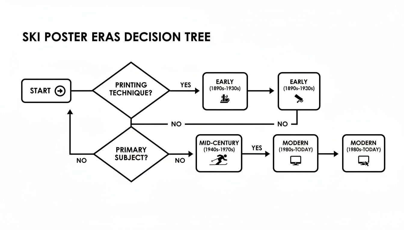
Getting a feel for these distinct periods is the first step. It tells you what characteristics to look for in an authentic poster from a specific time.
The first and most telling clue is the paper itself. Original vintage posters were printed on paper that is fundamentally different from what we use today. It was often a thinner, more acidic stock that yellows and can become brittle over the decades. A pristine, bright white paper is an immediate red flag.
Look closely for a natural patina—a gentle, even discolouration that comes from years of exposure to light and air. This aging process is almost impossible to fake convincingly. You might also spot faint stains known as "foxing," which are small brownish spots caused by mould growth on old paper. While not ideal for the poster's condition, they are a strong sign of genuine age.
An authentic vintage ski poster should feel its age. If the paper looks and feels like it just came off a modern printer, it probably did. Trust your senses—the material itself is often the most honest part of the poster.
The way a poster was printed is a dead giveaway. The vast majority of original ski posters from their golden age (roughly up to the 1960s) were created using stone or plate lithography. This technique leaves behind distinct visual markers that modern digital prints simply don't have.
Grab a magnifying glass or just use your phone's camera to zoom in on the coloured areas.
The difference is like comparing an original oil painting to a photograph of one. The lithograph has a tangible depth and texture to its colour, whereas the digital print feels flat and mechanical up close. The vibrant, layered inks of an original vintage ski poster have a unique visual weight you can learn to recognise.
Original posters were functional objects, not just art. They were glued to walls, folded up for distribution, and tacked onto notice boards. Evidence of this past life is another powerful indicator of authenticity.
Inspect the poster for faint, original fold lines. Many were sent to travel agencies folded, and these creases can still be visible even after being flattened or linen-backed for preservation. Be cautious, though—creases can also be faked, so look for wear along the folds that seems consistent with the poster's overall age. Similarly, tiny pinholes in the corners or small tears along the edges suggest a piece that once served its purpose out in the world.
These signs of use and age separate a true historical artefact from a sterile reproduction. It's also worth noting how different artists of the period approached their work, which influenced their graphic styles. If you appreciate Scandinavian design, for instance, you might enjoy learning about the iconic patterns in a Josef Frank poster and comparing them to the alpine art of the same era. Understanding the broader artistic context provides yet another layer to authenticating a piece.
Ever wonder why one vintage ski poster fetches several thousand pounds, while another that looks just as stunning is surprisingly affordable? It’s a great question, and the answer isn't always obvious. Like any collectible, from classic cars to rare coins, what you're really looking at is a delicate dance between supply and demand.
Several key ingredients come together to turn what was once a simple travel advertisement into a highly sought-after work of art. Understanding them is the first step for any budding collector.
Think of a poster's value as being built on four main pillars. If a piece is strong in all four areas, you're likely looking at a top-tier collectible.
Once you have a feel for a poster's baseline value, its physical condition is the next critical factor. Even the rarest poster in the world will take a major hit in value if it's in rough shape. To keep things clear, dealers and auction houses use a fairly standard grading system.
It generally runs from Grade A down to Grade D:
A poster's condition is part of its story. While a pristine Grade A piece is the holy grail for an investor, a Grade B or C poster with a bit of visible history can have its own charm and is often much more accessible.
The global market for these posters has seen some incredible growth. Reports from major auction houses, for instance, showed prices for top-tier vintage ski posters climbing dramatically during the market boom of the late 1990s and early 2000s. One analysis from Christie's auctions noted an increase of nearly 30 percent per year over a nine-year period. You can find more fascinating insights into these trends by exploring the history of collecting vintage ski posters on Antique Collecting.
By learning to weigh rarity, artist, subject, and condition, you start to develop a real feel for this unique art market. That knowledge is what helps you spot a genuine treasure, negotiate with confidence, and build a collection that’s not only beautiful but also holds its long-term value.
A vintage ski poster is a powerful piece of design. It's so much more than just a picture; it's an injection of energy, history, and alpine spirit that can completely transform a room. Bringing one into your home is a fantastic way to create a focal point that tells a story, sparks conversation, and celebrates a love for the mountains.
The real trick to styling these artworks is to let their character shine. Whether you have one prized original or a collection of beloved reproductions, the goal is to weave them into your home in a way that feels intentional and complements your existing decor. From minimalist entryways to cosy living rooms, there's a perfect place for a vintage ski poster.
When you have a single, powerful poster, placement is everything. Think about using it as the main statement piece in a room that needs a jolt of colour and personality. An entryway, for example, is the perfect spot to make a bold first impression. Hung above a sleek console table, it sets a tone of adventure and style the moment someone walks through the door.
In the same way, a large vintage ski poster hung above a sofa in the living room or a desk in a home office immediately draws the eye. This approach works especially well in minimalist or modern interiors, where the poster’s vibrant graphics can create a beautiful contrast against clean lines and neutral tones.
A vintage ski poster should command attention without overwhelming the space. Think of it as the anchor of the room—a piece that all other elements subtly revolve around, providing both visual interest and a clear sense of theme.
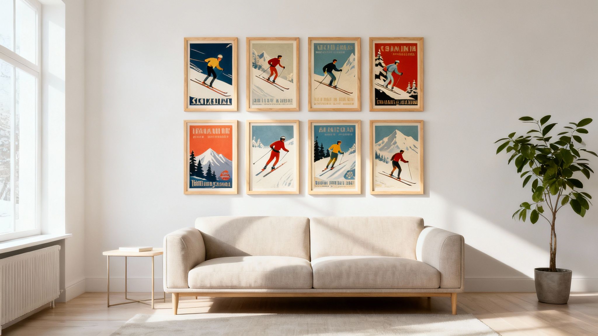
If you've managed to collect multiple posters, a gallery wall is a brilliant way to show them off. This method lets you tell a bigger story by grouping posters by artist, resort, colour scheme, or era. What you end up with is a dynamic and deeply personal installation that turns an empty wall into your own curated exhibition.
To pull off a balanced gallery wall:
This technique is particularly effective in larger spaces like hallways or along a staircase, where the collection can be admired as you move through the home.
The clean graphics and bold colours of many mid-century ski posters are a natural match for Scandinavian design. This aesthetic, which prizes simplicity, natural materials, and function, provides the perfect, uncluttered backdrop for these historic artworks to truly stand out.
Picture a bright, airy room with light wood floors and simple, well-crafted furniture. A classic Art Deco ski poster adds a splash of rich, historical colour without disrupting the room's serene feel. The connection between natural elements is key. You can explore how artists use organic materials in other forms of decor by reading our guide on the timeless appeal of wood wall art.
The final touches—framing and lighting—are what elevate a poster from a simple print to a true piece of art. Your frame should protect the poster while complementing both the artwork and your decor. For a classic, rustic look, a natural wood frame is ideal. For a more modern or industrial space, a thin black or sleek metal frame works beautifully.
Lighting is just as crucial. A dedicated picture light installed above the poster will make its colours pop and ensure it remains a focal point, even in the evening. This professional touch highlights the artwork’s details and shows that it's a valued part of your home’s design. By carefully considering these elements, you honour the history of your vintage ski poster and give it the showcase it truly deserves.
Diving into the world of vintage ski posters is thrilling, but it naturally comes with a few questions. Whether you're just starting your collection or you're a seasoned pro hunting for a specific piece, getting clear answers is key. Think of this as your personal FAQ, where we've gathered the most common queries to help you collect with confidence and care for your art the right way.
Yes, absolutely. In the hands of a skilled paper conservator, even a poster showing its age with tears, water stains, or foxing can be brought back to life. The process is a delicate art, often involving careful cleaning, de-acidifying the paper to halt decay, and sometimes mounting it on a supportive backing like linen or Japanese paper.
But the real question isn't can it be fixed, but should it be? For a truly rare or valuable poster, professional restoration is a smart investment that boosts both its beauty and its lifespan. For a more common find, however, the cost of restoration might be more than the poster is worth. It's always best to get a quote from a reputable conservator before you decide.
Finding a source you can trust is the single most important step in building a genuine collection. While you might get lucky and unearth a gem at a flea market, your safest bet is to connect with reputable dealers and galleries that live and breathe original vintage posters. These experts guarantee authenticity and can give you the full story on a poster's condition and history.
Here are a few reliable places to start your search:
When you're ready to buy, always ask for a Certificate of Authenticity or any known provenance. This paperwork is your peace of mind that you're getting the real deal.
A good dealer doesn't just sell you a poster; they share their passion and knowledge. They should be able to tell you about the artist, the printing method, and the poster's unique history, making your purchase that much more meaningful.
Proper preservation is all about protecting your poster so it can be enjoyed for generations. The biggest culprits that damage old paper are UV light, humidity, and acid. Shielding your collection from these three things is the most important thing you can do.
The gold standard here is archival framing. This means using UV-protective glass (or acrylic), an acid-free mat board, and an acid-free backing. Together, these create a safe little environment that protects the poster from fading light and stops harmful chemicals from damaging the paper over time.
A crucial tip: never hang a valuable poster in direct sunlight. Those UV rays are relentless and will cause the beautiful, vibrant inks to fade for good. It's also wise to avoid rooms with a lot of moisture, like bathrooms or kitchens, which can encourage mould and make the paper ripple.
Linen-backing is a professional conservation technique where a poster is carefully mounted onto acid-free paper, which is then attached to a canvas or linen backing. This process gives it incredible structural support, smoothing out old folds and making the poster much stronger and safer to handle.
If you have a poster that is fragile, particularly valuable, or very large, linen-backing is highly recommended. It not only stabilises the paper but also helps address minor tears or worn edges. While it is an extra cost, it’s considered the best practice in the high-end collecting world for a reason—it’s simply the best way to preserve an important piece.
At Dalaart, we celebrate the artistry and heritage behind unique collectibles. Explore our curated selection of authentic, hand-crafted Swedish folk art to bring a piece of Scandinavian tradition into your home. Discover your next treasure at https://dalaart.com.


.svg)


.png)


