May 14, 2026
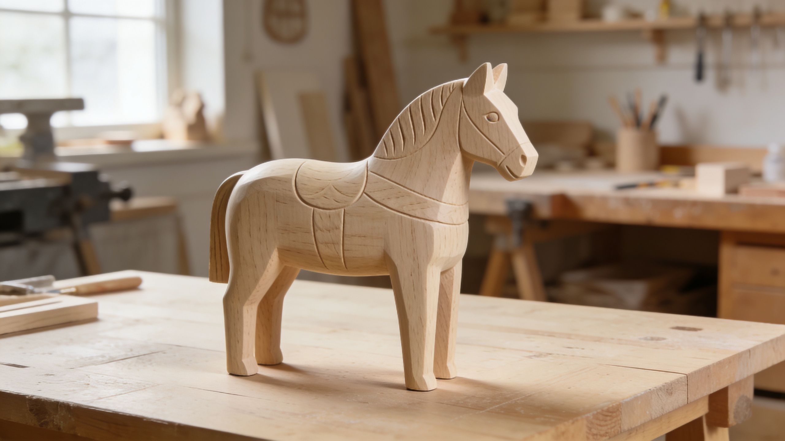
You're probably looking at a plain wooden Dala figure right now and thinking two things at once. First, it's lovely exactly as it is. Second, you can already see the animal inside it and want to bring that creature closer to life.
That instinct sits at the heart of doll to real work. In doll making, it usually means pushing a figure past decorative painting into convincing presence through surface, depth, eye detail, texture, and careful finishing. On a Dala horse, bear, rooster, or moose, the challenge is different because wood pushes back. Grain shows through. Edges are crisp where flesh would be soft. Traditional forms rely on stylisation, not illusion.
That's why the method matters. If you apply hyper-real techniques meant for vinyl or resin straight onto carved birch, the result often looks muddy, heavy, or oddly plastic. If you adapt those techniques to the logic of folk art, the figure keeps its dignity and gains character.
An unpainted Dala figure has a special kind of tension. It already carries history in its silhouette, but it hasn't yet chosen its personality. A traditional kurbits pattern is one answer. A more natural coat, alert eyes, subtle shadowing, and a textured mane are another.
The modern doll to real approach doesn't have to fight the Dala tradition. It can honour the same hand-crafted spirit by paying close attention to form, surface, and finish. Woodcarvers simplified the animal into strong shapes. Your job is to read those shapes well, then decide where realism helps and where restraint serves the piece better.
A lot of makers are already leaning in that direction. A 2025 survey by the Swedish Handicraft Association of 1,200 folk art enthusiasts found that 68% experiment with unpainted Dala DIY kits for personalisation, while 42% report dissatisfaction with achieving “lifelike” results because of birch wood grain. The same survey noted that realistic modifications can increase resale value by up to 25% on Swedish platforms (Swedish Handicraft Association findings referenced here). That tells me two useful things. People want this look, and most problems begin before the paint is even dry.
Collectors sometimes worry that realism dilutes heritage. That concern deserves respect. A Dala horse isn't a blank toy in the ordinary sense. It's part of a regional visual language.
But heritage has never been static. Folk art survives because people keep making choices within a tradition. If you're curious about how those choices live inside the workshop, the behind-the-scenes look at Dala making is worth your time.
Realism works best on a Dala figure when it supports the carving instead of trying to disguise it.
For beginners, the biggest shift is this. You're not trying to make the figure indistinguishable from a real animal. You're trying to make it feel believable.
That usually comes from a few controlled decisions:
Good results start with fewer materials than most beginners buy, but those materials need to suit wood. The point isn't owning a giant kit. The point is choosing supplies that let you control absorption, blending, and surface texture.

If you're starting with a blank figure, browsing proper unpainted Dala horses helps you judge shape, scale, and how much carved detail you have to work with.
Acrylic paint is the practical starting point for many artists. It dries quickly, cleans up easily, and builds in thin layers without much fuss. On wood, that speed is useful because you can seal earlier mistakes, rework edges, and avoid long periods where dust settles into tacky paint.
Oils have one major advantage. They stay open longer, so soft blending is easier. If you're painting a smoky grey horse coat, a soft muzzle, or transitions around the eye socket, oil can be lovely. But on a small wooden figure, oils also tempt beginners to overblend. The form loses crispness and the piece starts to look greasy.
My usual rule is simple.
You don't need twenty brushes. You do need the right shapes.
Synthetic brushes are usually the sensible choice with acrylics. They spring back well and don't mind repeated cleaning. If a brush can't hold a point, don't force it into eye work. Retire it to texture duty.
Practical rule: Use your nicest small brush only for detail. Don't dip it into primer, glue, or heavy-bodied paint.
Raw wood absorbs paint unevenly. That's the central technical issue in doll to real work on Dala figures. A wood-friendly primer or gesso creates a more predictable surface, which means your colour sits where you put it instead of sinking in patchily.
Keep these on the bench:
Beginners often reach for thick craft paint, oversized brushes, and one universal varnish. Those shortcuts usually create the exact problems they're trying to avoid. Thick paint fills crisp carving. Large brushes flood recesses. Full-gloss sealer makes a wooden horse look dipped rather than alive.
Skip anything that smells like a miracle cure. Reliable realism comes from thin applications and patient surface control.
Most failed realistic finishes can be traced back to the first hour at the bench. Not the colour choice. Not the shading. The prep.
Birch is beautiful, but if you paint directly onto it without managing the surface, the grain keeps announcing itself. Sometimes that's desirable. For a lifelike coat or smooth feather plane, it usually isn't.
The aim isn't to sand the figure into blandness. You want to soften rough fibres, remove handling grime, and create a surface the primer can grip evenly.
Use a fine sanding sponge or fine sandpaper and work lightly with the shape, not against it. On ears, muzzles, beaks, and carved edges, slow down. Those places lose definition quickly if you rush.
A good sanding pass does three things:
After sanding, wipe the piece with a barely damp lint-free cloth and let it dry fully. If you prime over dust, you lock that texture in.
A thick first coat feels efficient. It rarely is. Primer that goes on too heavily fills recesses, softens the carving, and leaves brush ridges that keep showing through later layers.
Apply a thin coat and let it dry. Then inspect under side light. If the grain still feels too present for your design, add another thin coat rather than one heavy rescue coat.
If you can still admire the carving after priming, you're on the right track. If the figure looks swollen, the primer is too heavy.
White primer brightens later colours. Off-white or light grey primer can help if you want a softer, more natural coat and don't want every layer to fight a bright underbase.
Run your fingertips across the dry primed surface. Your fingers catch flaws your eyes miss. If you feel a rough patch on the shoulder or chest, smooth it now with very fine abrasive and touch in the primer again.
Watch the transition zones carefully:
Those are the places where realism often succeeds or fails. Uneven primer there interrupts later shading and makes natural transitions harder.
If you want some grain to remain visible for character, leave it only in chosen areas, such as the base, saddle field, or a rustic companion animal with a rougher look. Intentional texture reads as style. Uncontrolled texture reads as a mistake.
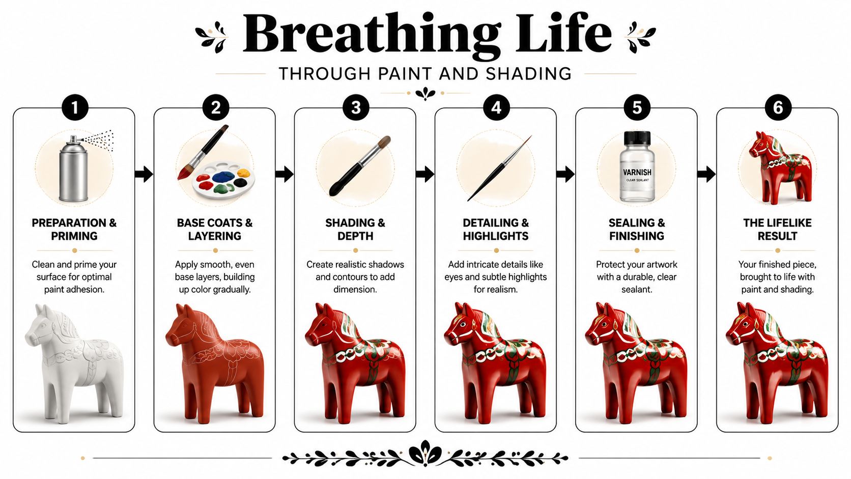
This is the stage where the figure stops being “a painted object” and starts reading as an animal. The shift doesn't come from one clever trick. It comes from layering values in the right order and keeping each layer thinner than your instinct tells you.
Start with the idea of volume. A real horse isn't one flat brown. Light lands on the shoulder differently than on the belly. The muzzle shifts in tone. The legs often darken as they narrow. If you train your eye to see those changes, your brushwork becomes calmer and more convincing.
Choose a coat family first. Chestnut, bay, black, dun, grey, and painted folk interpretations all need a different balance of warm and cool notes. Mix more base colour than you think you'll need, because remixing halfway through often changes the tone.
Apply the base coat in thin, smooth layers. Two or three light coats usually look cleaner than one opaque one. Let each layer dry before the next.
What matters here is consistency:
A slightly muted base often works better than a loud one. You can always brighten selective areas later.
A wash is paint thinned enough to settle into low areas and tint transitions without covering everything. On a Dala horse, place washes where form naturally turns away from light. Under the jaw. Between front legs. Along the belly. Around the muscle break at the haunch.
Use very little paint on the brush. It's easier to repeat a wash than to rescue a tide mark. If the wash beads up, the surface may be too slick or the mix too watery.
For a beginner, this sequence is dependable:
A useful colour mixing chart for painters can save frustration, especially when you're trying to darken a coat without accidentally making it dull or dirty.
A short visual demonstration helps if you paint by seeing rather than reading.
Dry brushing is often overused. Done heavily, it leaves a chalky, dusty surface. Done lightly, it catches raised planes and suggests hair direction, bone structure, or feather texture.
Load a brush, wipe almost all of it off on scrap paper, then pull it gently across raised areas. On a horse, that might include the brow ridge, the bridge of the nose, the shoulder, and the top edge of the hindquarter. On a rooster, it may be the feather edges and comb ridges.
Keep dry brushing for the final third of the painting process. If you use it too early, every later layer has to fight the scratchy texture it leaves behind.
Eyes carry more emotional weight than any other detail. They don't need to be large. They need to be placed cleanly and finished with intention.
For a horse or moose, start with a dark almond or rounded shape suited to the carving. Add a slightly lighter tone around it only if the scale supports it. Then place a tiny reflected light with a fine brush. One pin-point highlight is enough.
Use gloss sparingly at the very end, not during painting. Wet-looking eyes placed in a matte or satin face read as alive. Gloss spread around the whole eye socket reads as varnish.
Beginners often search for realism in tiny stripes of hair detail. The more important work is broader. A muzzle that is slightly cooler than the cheek. Knees and lower legs that deepen in tone. A chest that turns gently into shadow.
Try this instead of chasing micro-detail:
If the figure still looks flat, don't add decoration. Darken the shadows and refine the light pattern. Value does the heavy lifting.
Paint can suggest texture. Actual fibre changes the experience completely. A mane that lifts away from the neck, a felted bear coat, or a tufted tail catches light differently and gives the hand something to believe.
That doesn't mean adding fibre to every piece. It means using it when the figure benefits from tactile contrast.
A sustainability-minded approach is gaining ground in this area. There's been a 30% rise in commissions for upcycled Dala figures, and artisans are using methods such as embedding recycled wool felting for bear fur. These upcycled realistic hybrids have also been reported to command a 40% price premium on sites like Blocket.se as of 2026 (upcycled Dala figure trend reference). Even if resale isn't your goal, that trend highlights something useful. Texture added with care can deepen both character and appeal.
For horses, fine flax fibre and merino wool roving are both workable. Flax gives a straighter, cleaner fall. Merino gives softness and a fuller, brushed appearance. Match the fibre to the style of the carving.
The neatest attachment usually comes from a shallow channel or drilled anchor points if the figure design allows it. If you'd rather avoid altering the wood, build the attachment line along a painted mane ridge and hide it under successive layers of fibre.
A simple method works well:
Use less fibre than you think. Oversized manes make a solid carved body look clumsy.
Fibre should echo the figure's movement. If the carving is compact and upright, keep the mane tidy. If the neck stretches forward, a slight sweep adds life.
Recycled wool is excellent for companion animals because it brings softness without looking synthetic. Felted too densely, though, it can swallow the carving. The trick is to treat wool as a skin of texture, not a bulky costume.
Apply sparse wisps first, especially around the shoulders, back, and haunches. Leave thinner coverage around facial features so the carving still does its job. Then needle or press the wool into place in stages until the coat reads as natural.
Good candidates for added felt texture include:
A scrap of linen, a tiny harness, or a saddle blanket can support the doll to real look if it belongs to the figure's story. But the more textiles you add, the easier it is to leave folk art and drift into miniature costume work.
One textile detail is often enough. It should support the animal, not distract from it.
The last stage decides whether all your earlier work stays subtle or tips into overworked. Finish choices change colour depth, surface feel, and how believable the figure looks in ordinary light.
One varnish for the entire piece is rarely the best answer. Real animals don't reflect light evenly, and neither should your figure.
Use matte on furred or feathered areas where you want softness. Use satin on most painted body surfaces if you want a gentle, natural sheen. Use gloss only on details such as eyes, a damp-looking nose, or perhaps a beak tip if the species suits it.
Apply thin coats and let them cure properly. If varnish clouds or drags, stop and reassess. Rushing the protective finish can flatten all the lovely variation you built into the paint.
A little ageing can make a new figure feel settled and handled, especially if you like the look of old workshop pieces. The safest method is a very diluted earthy wash worked into selected recesses and then wiped back from raised planes.
Keep it controlled. Too much ageing makes a carefully painted animal look dirty rather than storied.
A restrained patina works well in these places:
Many beautiful pieces look disappointing in photos because the light is wrong. Use indirect daylight if you can. A plain background in a muted tone helps the paintwork read clearly. Shoot from the figure's eye level or slightly below for more presence.
Take one full profile, one three-quarter angle, one close-up of the face, and one detail shot of the texture work. If the gloss on the eyes throws a harsh glare, shift the light source rather than adding more editing later. The camera should record the finish accurately.
If you'd like a strong starting point for your own doll to real project, Dalaart offers authentic Swedish Dala horses and companion animals, including unpainted DIY pieces that are ideal for practice as well as beautifully finished works for inspiration. It's a fine place to explore the tradition, study form, and support the artisan community in Dalarna.


.svg)


.png)


