May 15, 2026
You've found a new york poster you love. Then you open ten more tabs and suddenly everything looks either too touristy, too slick, too fake, or too loud for your home.
That's usually the main problem. It isn't choosing New York as a subject. It's choosing a piece that can live comfortably with pale oak, old pine, linen, worn leather, ceramics, books, and the quiet restraint that makes Scandinavian and vintage interiors feel settled rather than staged.
A good New York poster holds tension in the best way. The city is fast, graphic, layered, and iconic. A thoughtful home is edited, personal, and calm. When those two qualities meet properly, the result feels less like souvenir shopping and more like collecting. The poster stops being wall filler and starts acting like a memory, a reference point, or a small declaration of taste.
A new york poster often gets treated as a generic decorating shortcut. Buy a skyline, add a frame, hang it above the sofa, done. That approach rarely works in a considered room because the piece has no job beyond covering a blank wall.
In practice, people buy wall art for more personal reasons. In Sweden, IKEA's 2024 Life at Home report found that home decoration is one of the most emotionally loaded purchase categories, a useful reminder that decor choices usually carry meaning, not just style preference, as noted in this summary of the buying context. That's why the right poster tends to feel obvious once you identify what you want it to represent.
Ask a simpler question before you browse. Is this poster meant to recall a trip, anchor a room, introduce contrast, or act as a gift with a story behind it?
Those are different purchases.
A poster belongs in a room when it says something about the person living there, not just about the city pictured on it.
New York has visual force. That's exactly why it can look striking in a Scandinavian interior, where the rest of the room gives it space. A typographic print can sharpen a soft room. A faded vintage travel poster can warm up a minimalist one. A moody black-and-white photograph can echo old wood, iron, wool, and patinated surfaces.
The mistake is choosing the loudest image rather than the most compatible one. If your home already has strong pattern, carved objects, folk art, or vintage textiles, the poster should probably bring structure. If the room is very spare, the poster can carry more drama.
Many homeowners know they like “a New York print” long before they know which visual language suits their home. That gap leads to the wrong purchase. Style first, city second, is often the better way to shop.

This is the classic choice for vintage lovers and often the easiest bridge into a Scandinavian home. The colours are usually flatter, the composition cleaner, and the mood more distilled than photography. Even when the city is busy, the design tends to feel organised.
Their appeal isn't random. New York became an unusually powerful poster subject because its growth was extraordinary. The city's population grew more than 225-fold between 1790 and 1900, reaching 3,437,202, which helped establish it as one of the world's most recognised urban brands in the age of travel and advertising posters, according to New York population history.
Choose this style if you like:
If you enjoy graphic art with a similarly strong visual attitude, Dalaart's piece on pop art poster inspiration is a useful contrast point. It helps clarify whether you want retro travel charm or something more punchy and pop-driven.
Photography gives you a different New York. Less myth, more atmosphere. A skyline at dusk can feel polished and architectural. A grainy street scene can feel intimate and almost documentary.
This style works best when the room needs depth rather than decoration. In a pale interior, a dark photographic print can add weight. In a room with many vintage objects, a clean black-and-white city image can stop the space from drifting into clutter.
These are often underestimated. A subway map interpretation, borough names, coordinates, or a crisp text-based layout can be the smartest option in a room already full of texture.
Typographic posters suit interiors where line and structure matter. Think oak frames, white walls, ribbed glass, stoneware, and edited shelves. They don't compete with the room. They tighten it.
This is the most personal category. Here, New York becomes a subject interpreted through colour, brushwork, collage, or drawing rather than being depicted in a straightforward manner.
Some are whimsical, some architectural, some almost abstract. If you want your poster to feel less common, this category usually gives you the strongest chance of finding a piece with individual voice. It's especially effective when you want a new york poster to converse with vintage finds rather than match them too neatly.
The best style choice isn't the most iconic one. It's the one that makes the rest of the room look more intentional.
Where you buy matters as much as what you buy. A beautiful image printed badly still looks cheap. A good reproduction with clear licensing can be a far better purchase than a supposedly “rare” print with vague origin, weak paper, and evasive seller language.

Buying vintage gives you texture that modern reproductions often can't fake. Slight toning, older inks, old gallery labels, and period printing quirks can make a piece feel alive. But vintage buying requires patience and a willingness to inspect condition carefully.
Look at:
If the listing avoids direct language, walk away. “Vintage style” and “vintage” are not the same thing.
This is often the cleanest route if you want originality without the risks of older paper. Artist-direct purchases usually give you better context, clearer authorship, and more confidence about licensing.
You can also ask sensible questions without sounding difficult:
For buyers who care about artist identity and visual authorship, Dalaart's article on Keith Haring posters is a useful reference for how provenance changes the meaning of a poster, not just its look.
These platforms vary wildly. Some are excellent. Others are full of low-resolution files, copied artwork, or listings that never clearly explain rights, materials, or authorship.
A checklist is most helpful. In a digital market, authenticity has become a practical concern, especially where trust and sustainability shape buying behaviour. The EU's AI Act is introducing transparency rules, which makes it more important to ask whether a print is a licensed reproduction, whether archival materials are used, and whether the seller discloses AI involvement in the image creation.
Buyer's check: If a seller tells you everything about mood and nothing about origin, paper, licensing, or process, treat that as missing information, not marketing polish.
A listing usually deserves more scrutiny when it has several of these traits at once:
A strong seller doesn't need to oversell. They identify the maker, the print type, the paper, and the terms of reproduction clearly.
Many posters look disappointing for technical reasons, not aesthetic ones. The file was too weak, the paper too shiny, the size awkward, or the print process mismatched to the design. Good styling starts with good production.
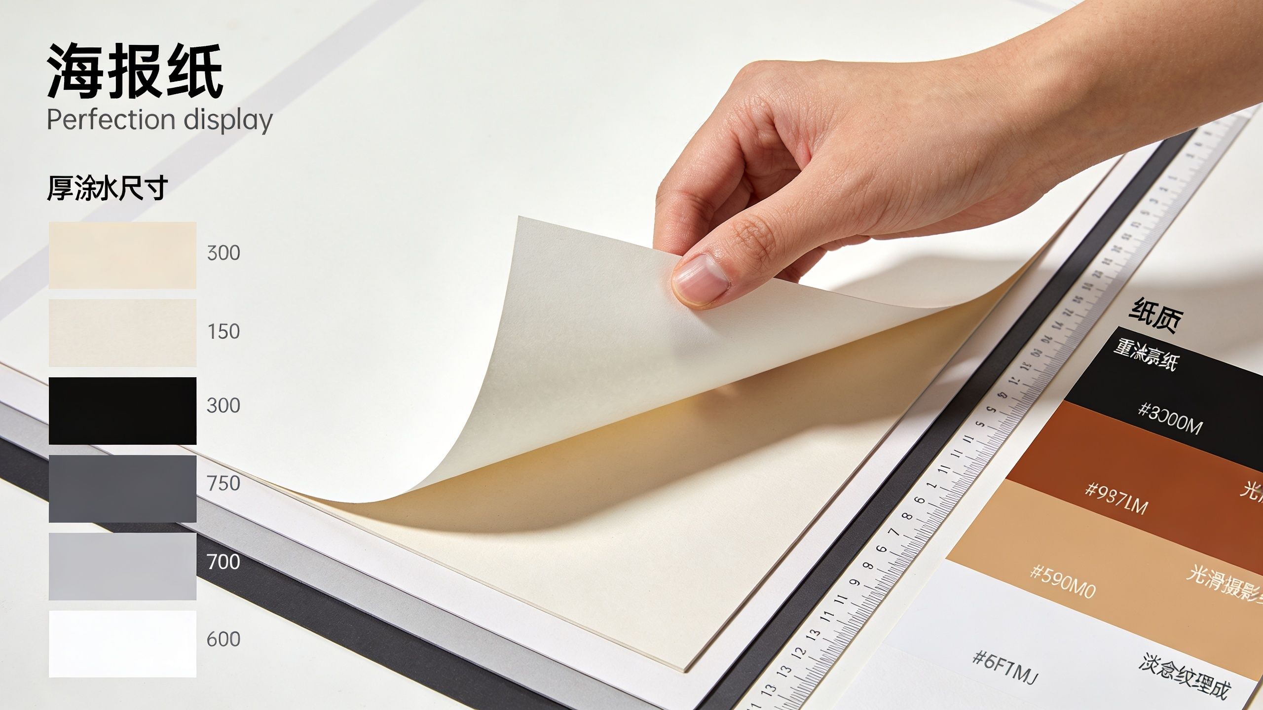
Standard sizes make life easier. Industry guidance commonly recommends 18x24, 24x36, and 27x40 inches, and using sizes such as 18x24 or 24x36 inches can reduce waste and simplify production, according to this guide to standard poster sizes and print setup.
For interiors, size changes the personality of the piece:
A common mistake is buying too small because it feels safer. In a room with high ceilings or long walls, undersized art looks apologetic.
A matte finish tends to suit Scandinavian and vintage spaces because it softens the image and reduces glare. It also sits more comfortably beside natural materials like limewashed walls, oak, linen, wool, and handmade ceramics.
Gloss can work, especially for saturated photography or more contemporary interiors. But in bright rooms, glossy surfaces often reflect windows and lamps in a way that weakens the image.
Practical rule: If the room gets strong daylight and you want the poster to feel calm, choose matte before you choose a more vivid image.
Print quality depends on file preparation as much as paper. The same industry guidance recommends building files at 300 ppi at final size with a .125-inch bleed, and notes that sharpness on ClaroBulk 170 g/m2 matte stock depends heavily on correct prepress.
If you're ordering a custom print, look for these basics:
Good technical choices don't call attention to themselves. They make the poster feel settled, crisp, and worth framing.
Framing decides whether your poster looks collected or temporary. Even an excellent print can feel unfinished in the wrong frame, while a modest print often becomes far more convincing once its borders, materials, and spacing are handled properly.
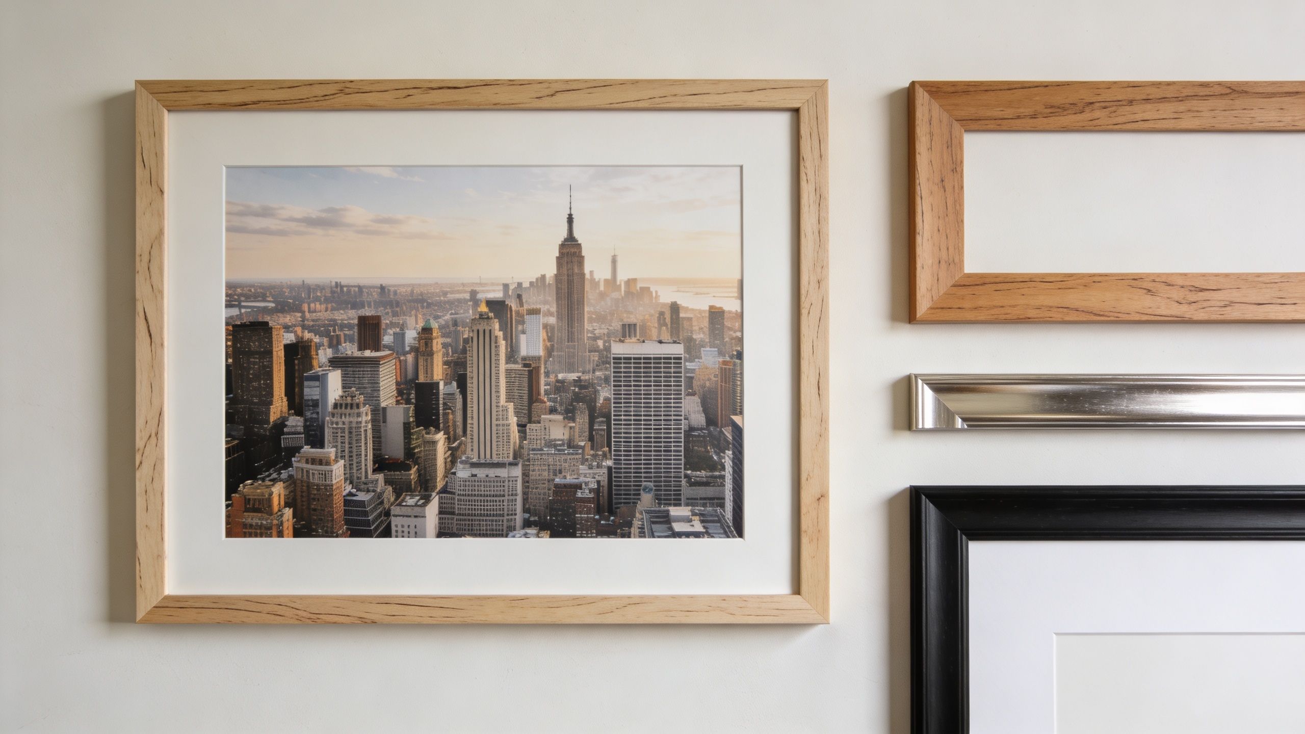
Natural wood brings warmth. It's the easiest choice when you want a New York image to sit comfortably with Scandinavian furniture, vintage pine, woven textures, and handmade objects. Oak, ash, and lighter woods keep the overall impression soft.
Thin black metal does something else. It sharpens the piece and introduces a more urban edge. That can be very effective for architecture photography, monochrome prints, or typographic work.
A few combinations work particularly well:
A mount gives the poster breathing room. It separates the printed image from the frame and makes even a simple poster feel more deliberate. In interiors with many objects and textures, that visual pause matters.
If the print already has a strong border, you may not need one. If the image runs close to the edge or has lots of visual detail, a mount usually improves it.
A frame should support the print, not dress it up beyond recognition.
Vintage New York posters can hold more than decorative value. Their imagery often reflects the city at a specific social moment. By 1890, 42% of New York's 1,515,301 residents were foreign-born, and later immigration further diversified the city, as outlined in this demographic history of New York City. That makes preservation less about fussiness and more about respecting the print as a visual document of its time.
Use these habits if the poster matters to you:
If you want to see mounting and framing decisions in action, this walkthrough is a helpful visual reference.
A good framer often saves you money in the long run. They'll tell you when a poster needs a spacer, when acrylic is safer than glass, and when the paper should never be dry-mounted.
The most satisfying rooms don't treat art as a final step. They let it influence everything around it. A new york poster can bring pace, memory, and graphic structure into a Scandinavian or vintage interior, but only if the styling around it feels equally intentional.
A minimalist room can carry a large New York poster beautifully. Keep the rest restrained. A soft rug, oak bench, simple lamp, and one or two ceramics are often enough.
If the poster has strong blacks, repeat that tone lightly elsewhere. A black lamp stem, a dark picture rail, or a small iron object can tie the composition together without making the room feel themed.
For readers drawn to quieter compositions, Dalaart's perspective on minimalist poster art pairs well with this approach.
Vintage interiors usually look best when the poster joins a group rather than standing alone. Hang it with older frames, personal photographs, small sketches, and perhaps one sculptural wall object. The point isn't symmetry. It's balance.
Try mixing:
A New York poster doesn't require “city decor”. It only needs a sympathetic setting. A faded travel print can sit happily above a Gustavian chest. A black-and-white street photograph can work beside folk art if the palette is controlled. A typographic print can sharpen a room full of antiques.
One of my favourite combinations is an iconic city print with very grounded materials. Old wood. Flax linen. A chair with worn arms. Handmade pottery. That contrast is what keeps the room from becoming predictable.
If the poster feels slightly unexpected in the room, that's often a good sign. Contrast gives interiors memory.
When styling the final arrangement, step back and remove one thing. Then remove another if needed. Scandinavian rooms breathe because they aren't crowded. Vintage rooms charm because they're edited. The poster should feel discovered, not inserted.
If your home leans Scandinavian, folk-inspired, or vintage, small handcrafted details make the whole room feel more personal. Explore Dalaart for authentic Swedish pieces that pair beautifully with collected wall art and bring warmth, colour, and provenance into the spaces around it.


.svg)


.png)


